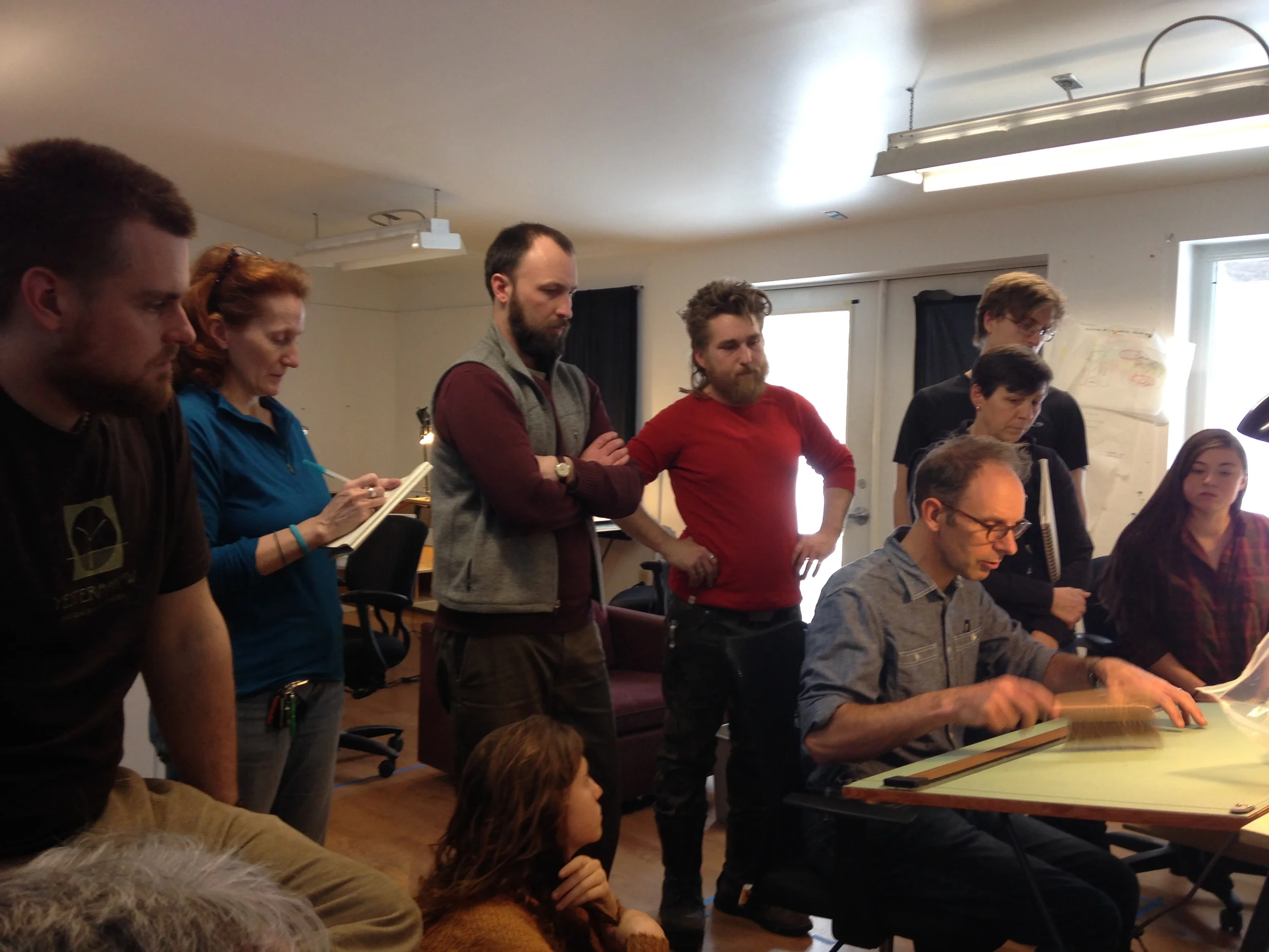
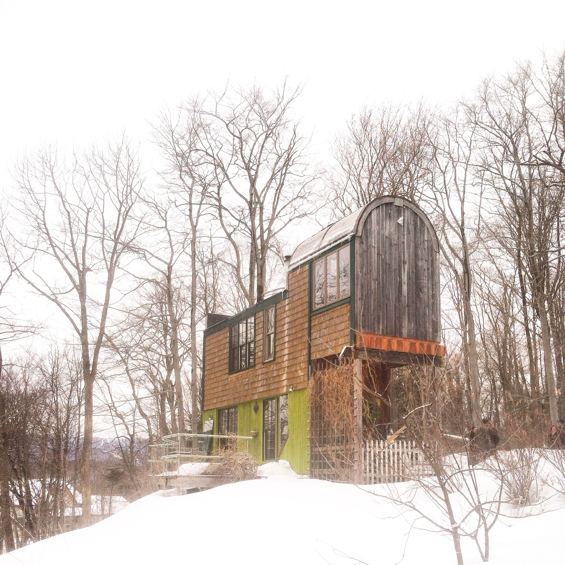
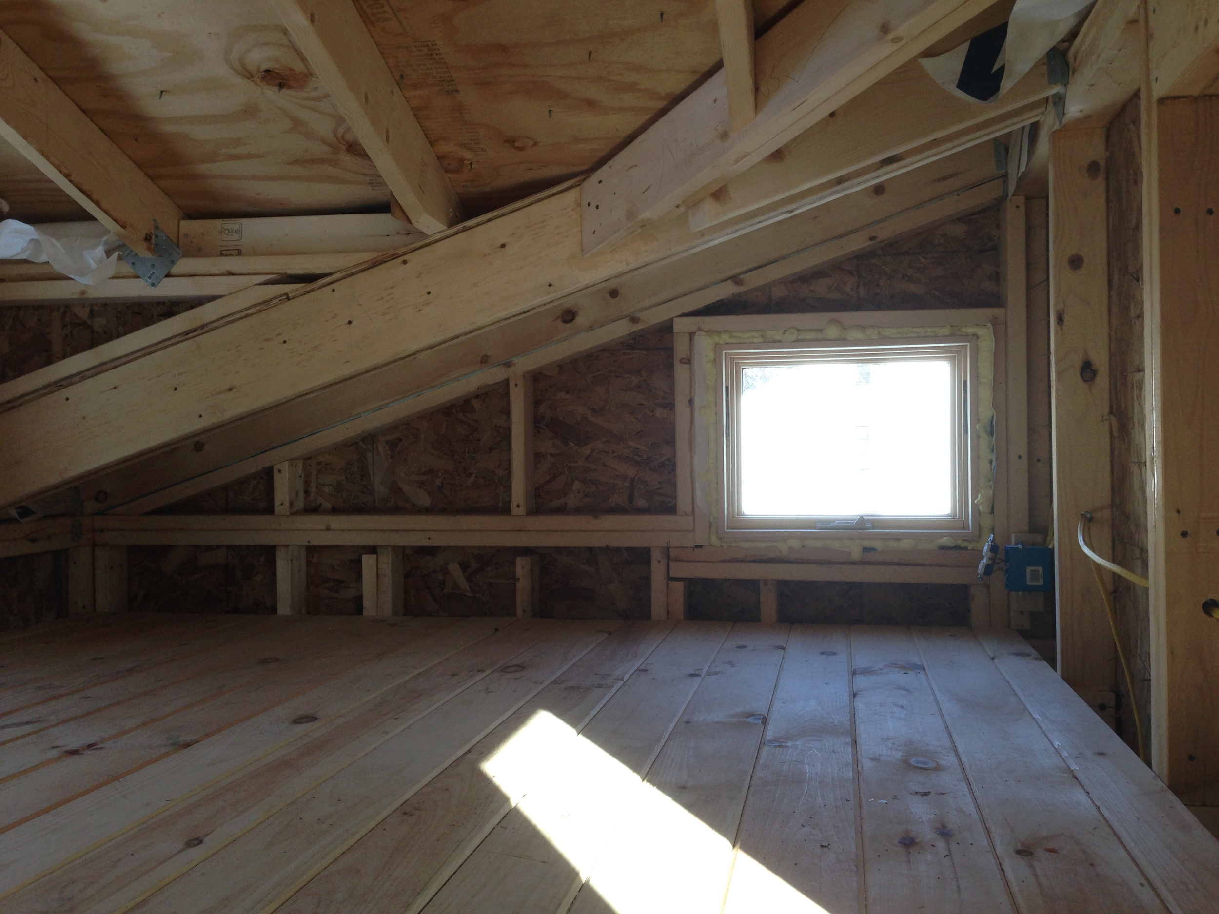
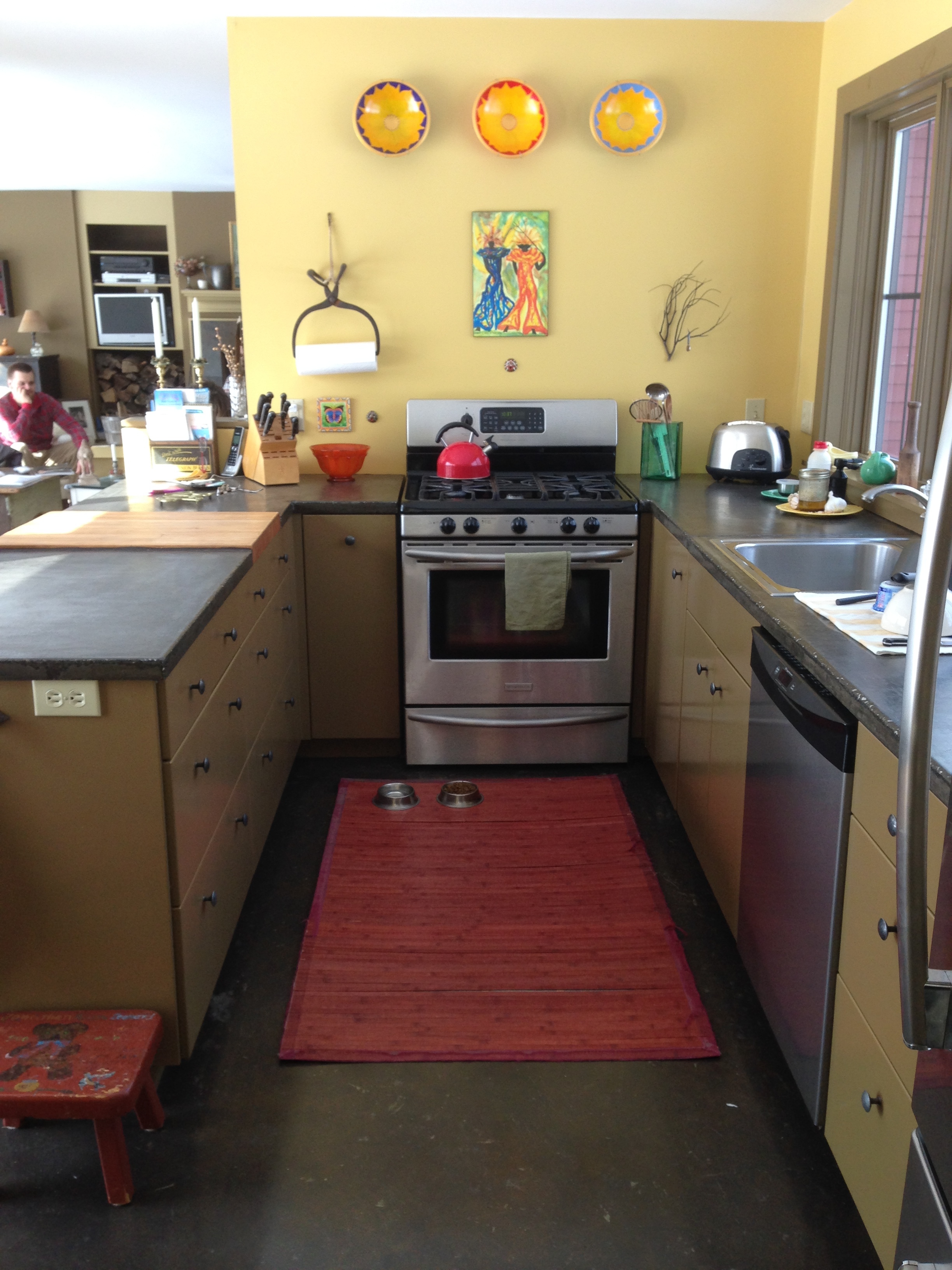
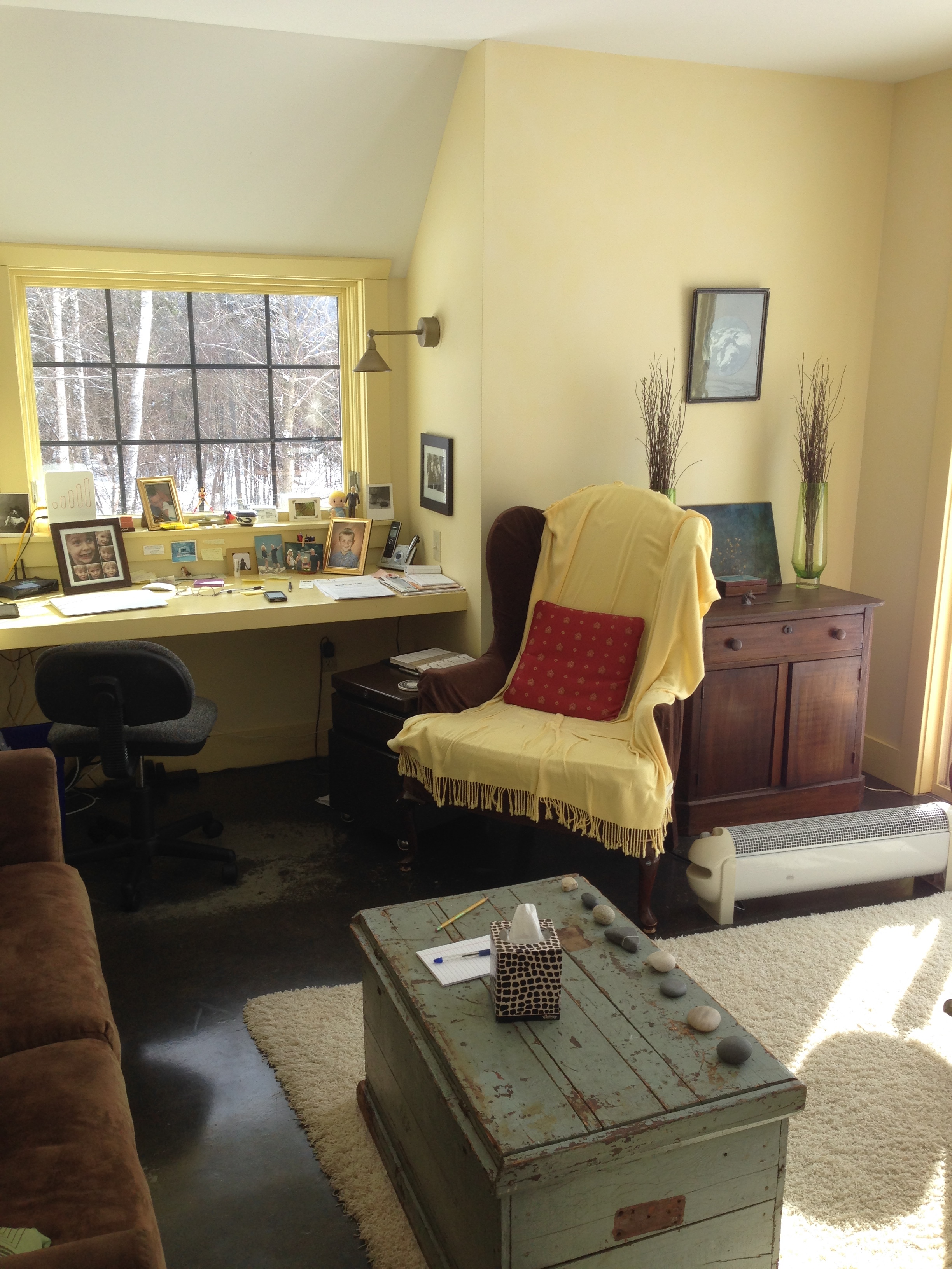
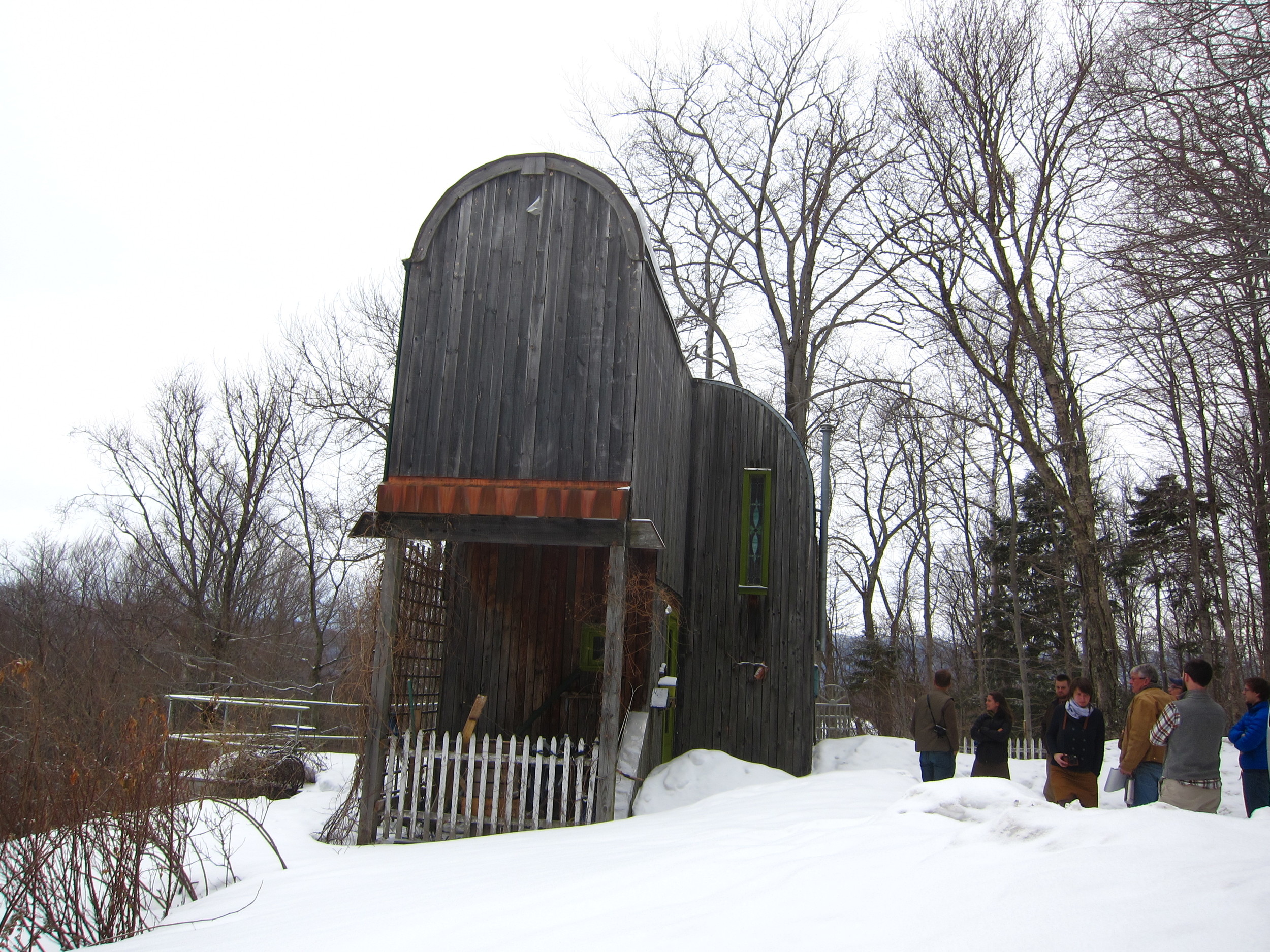
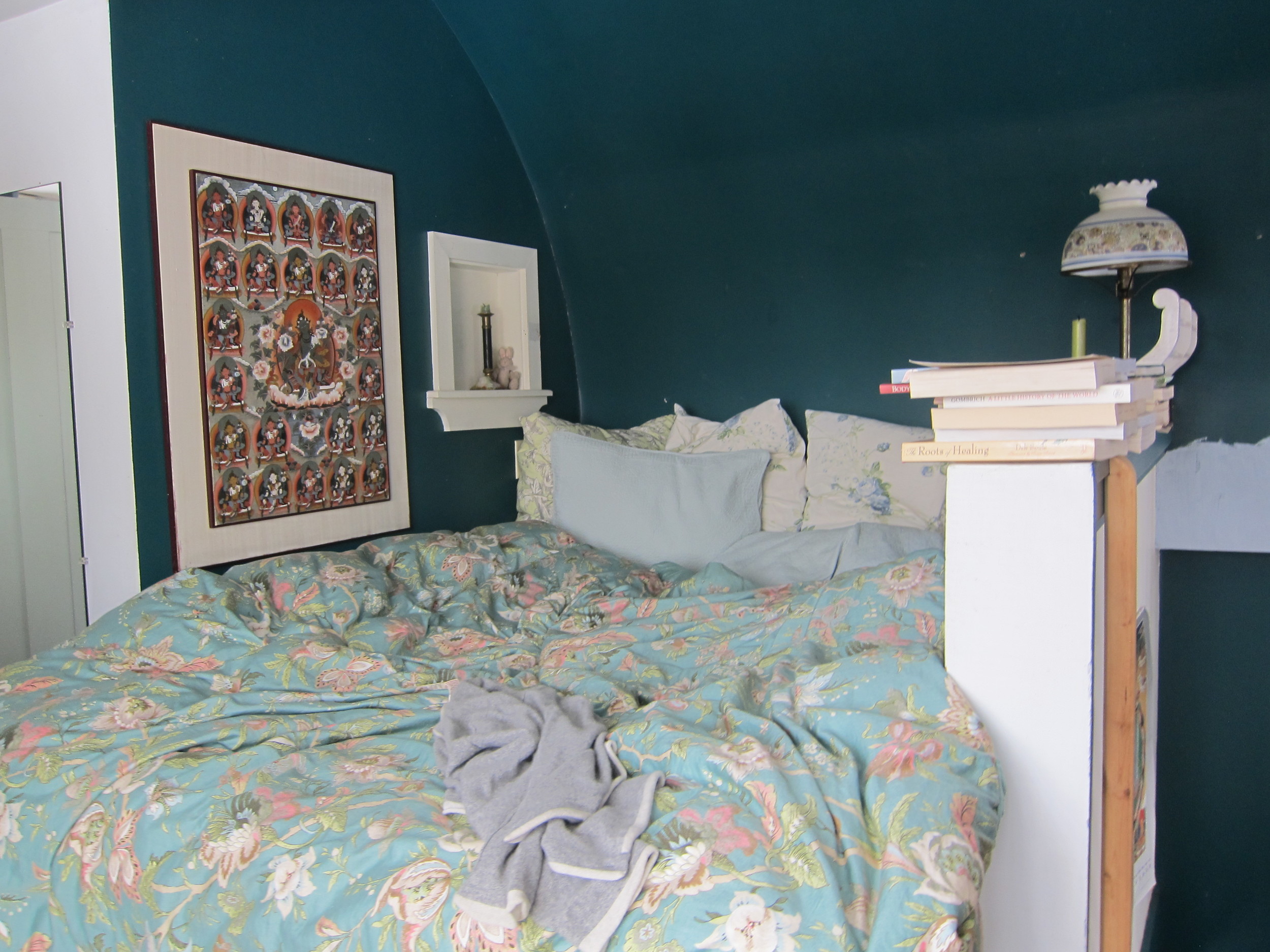
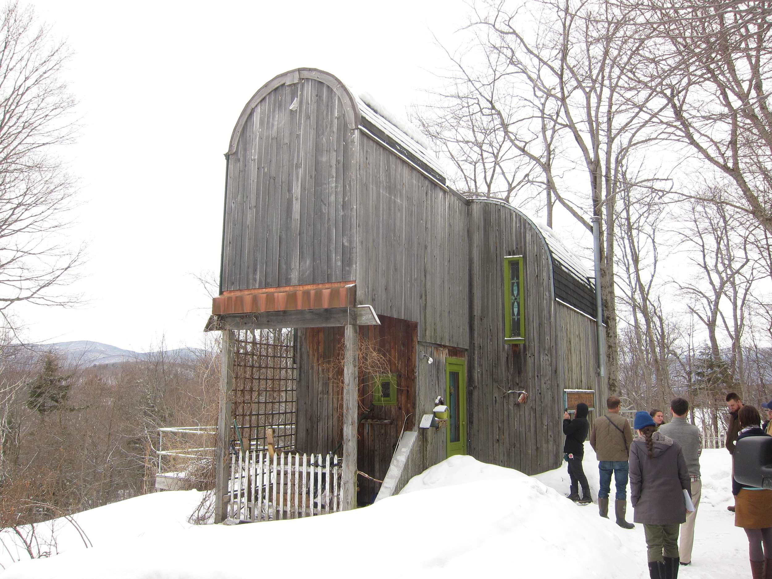
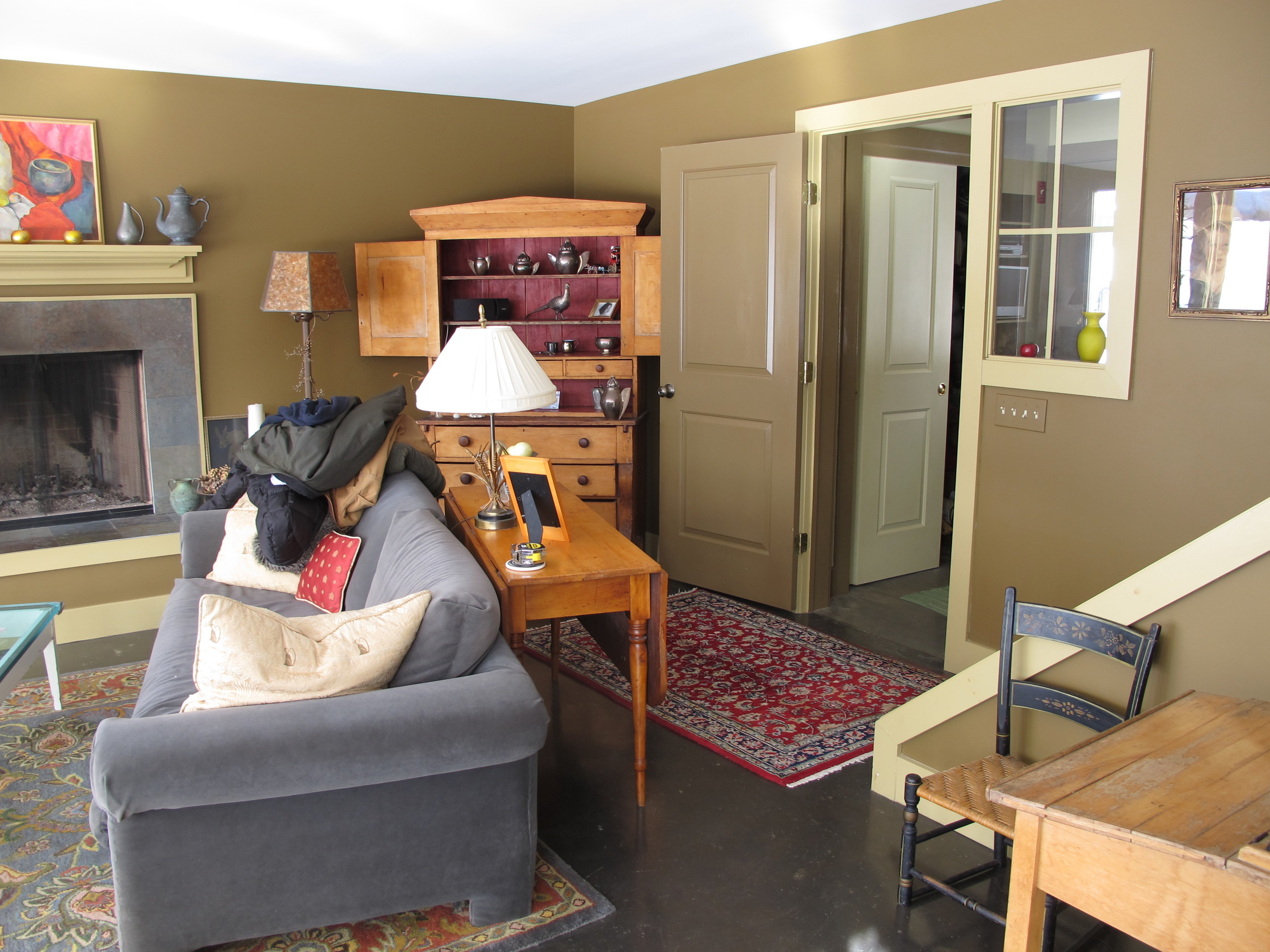
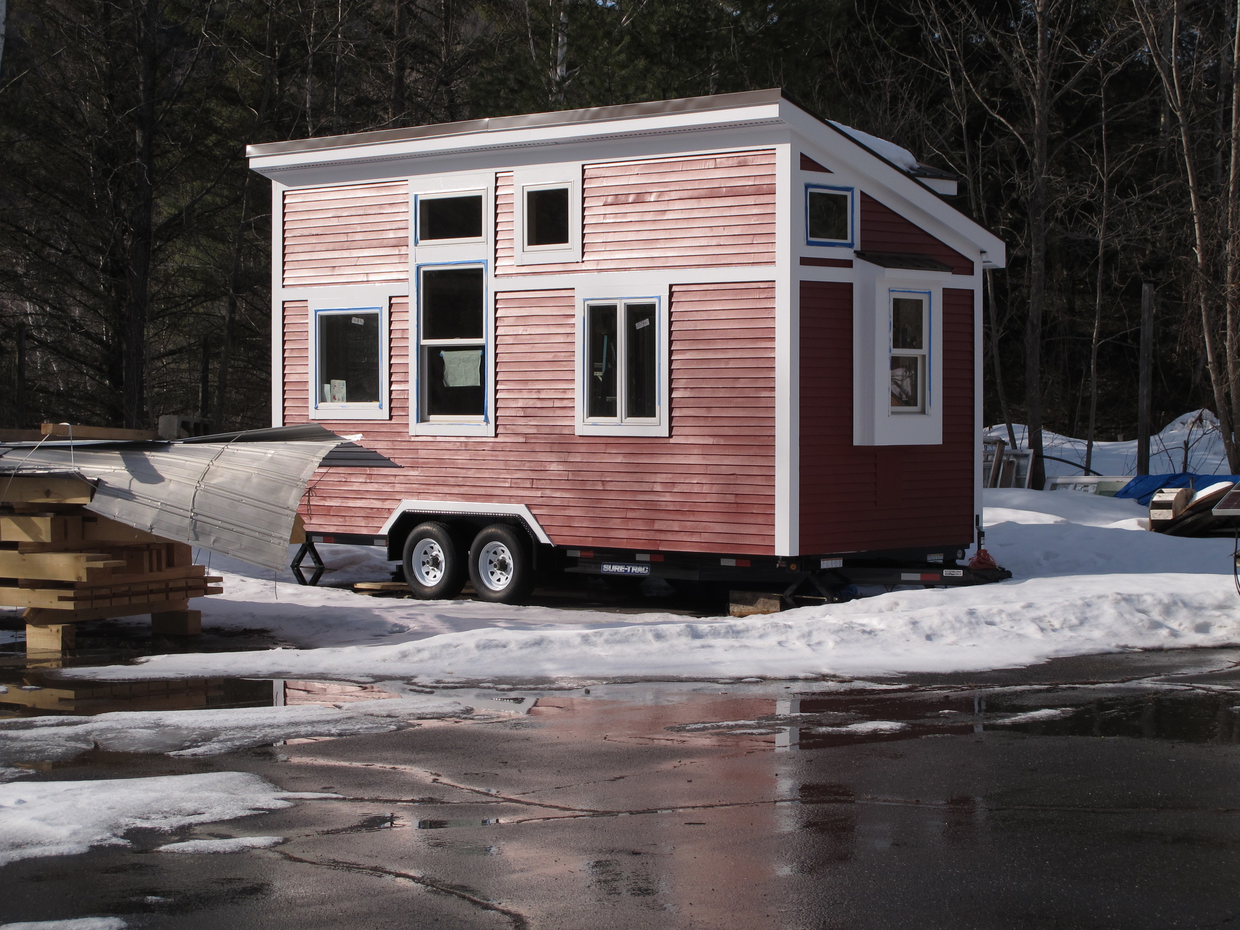
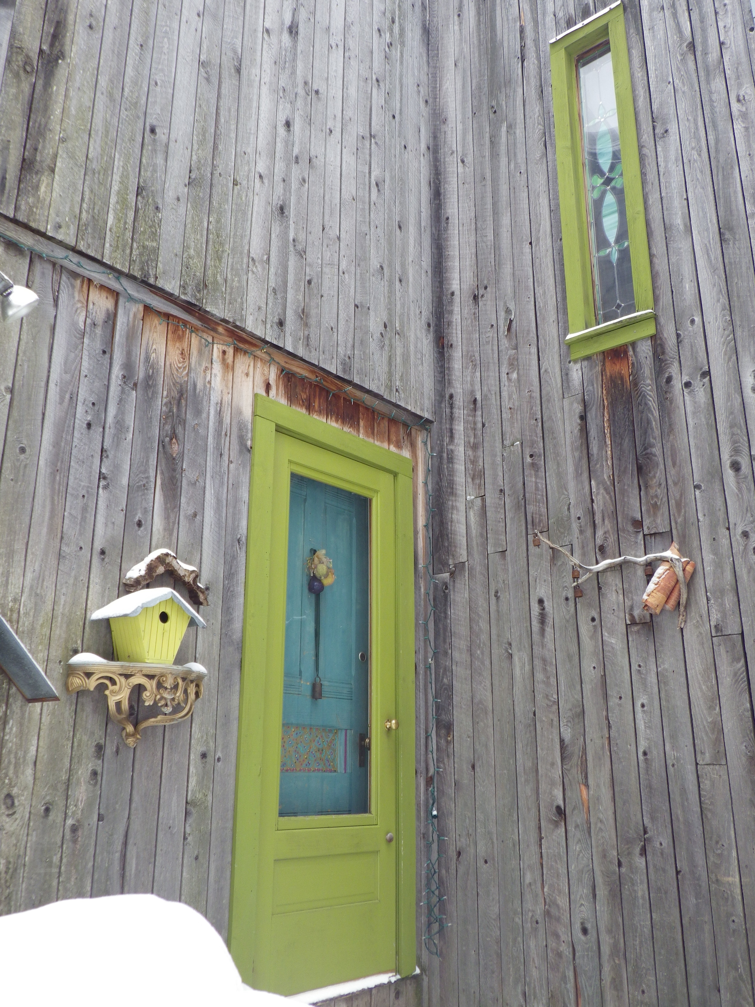
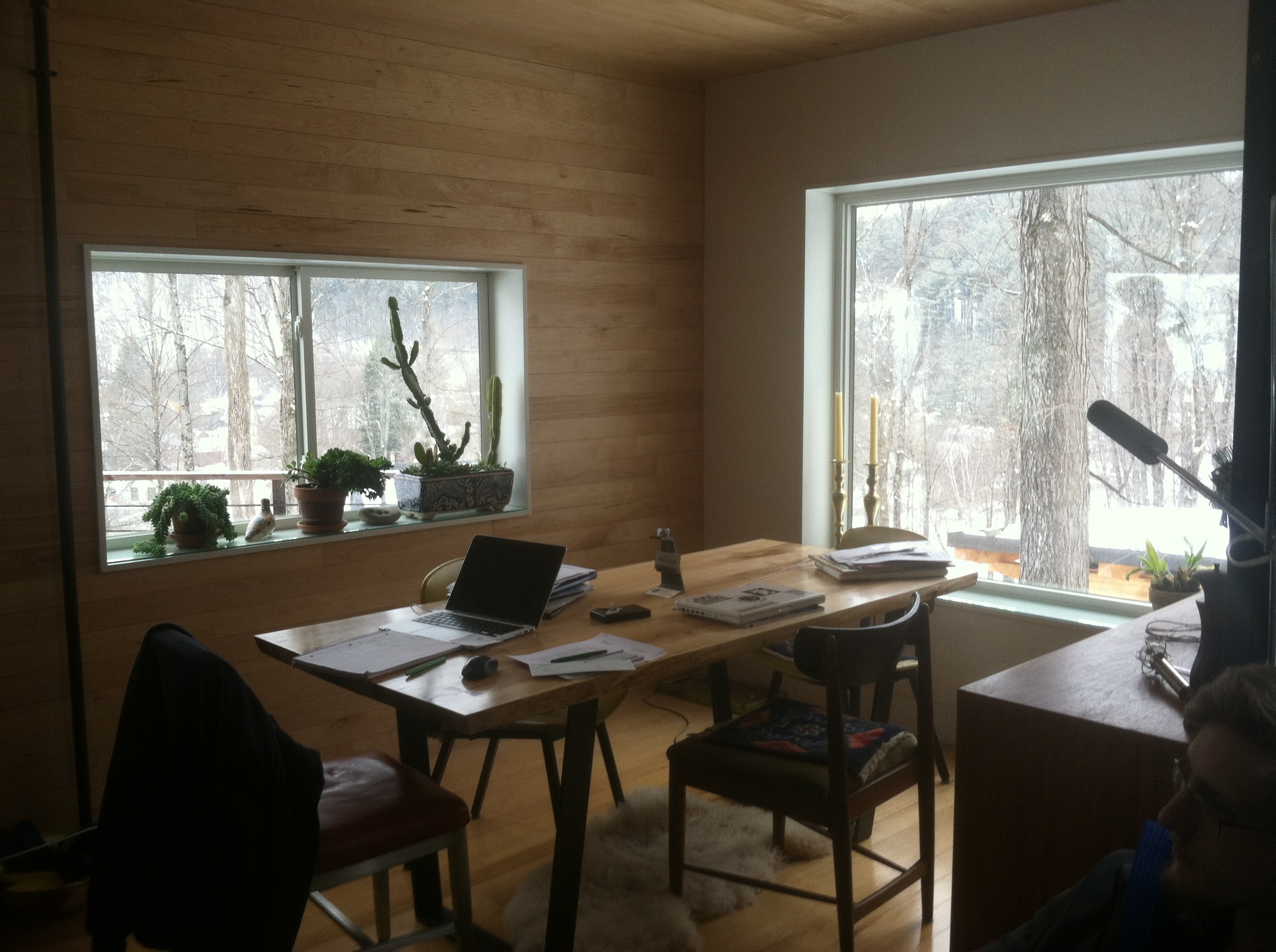
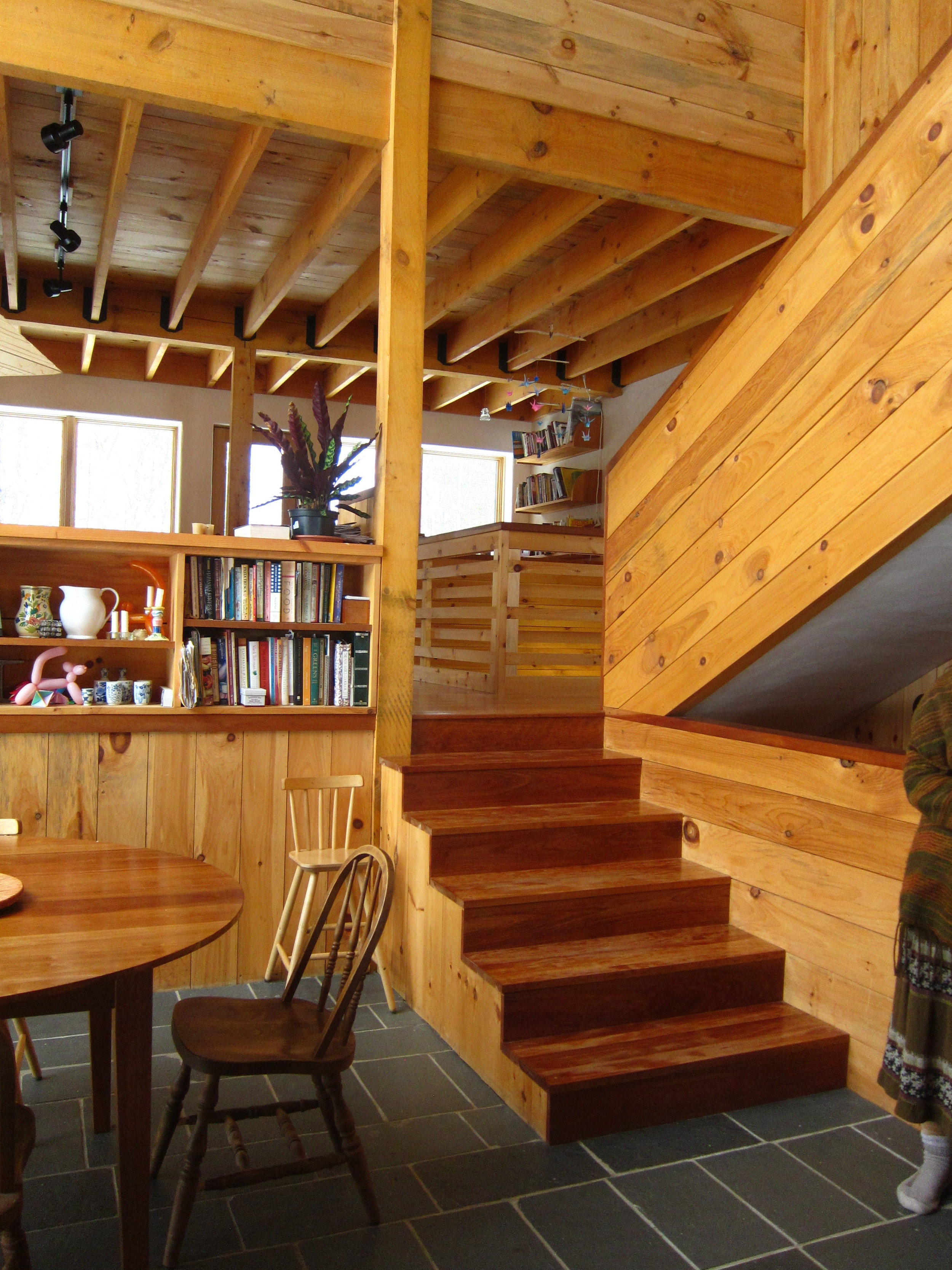
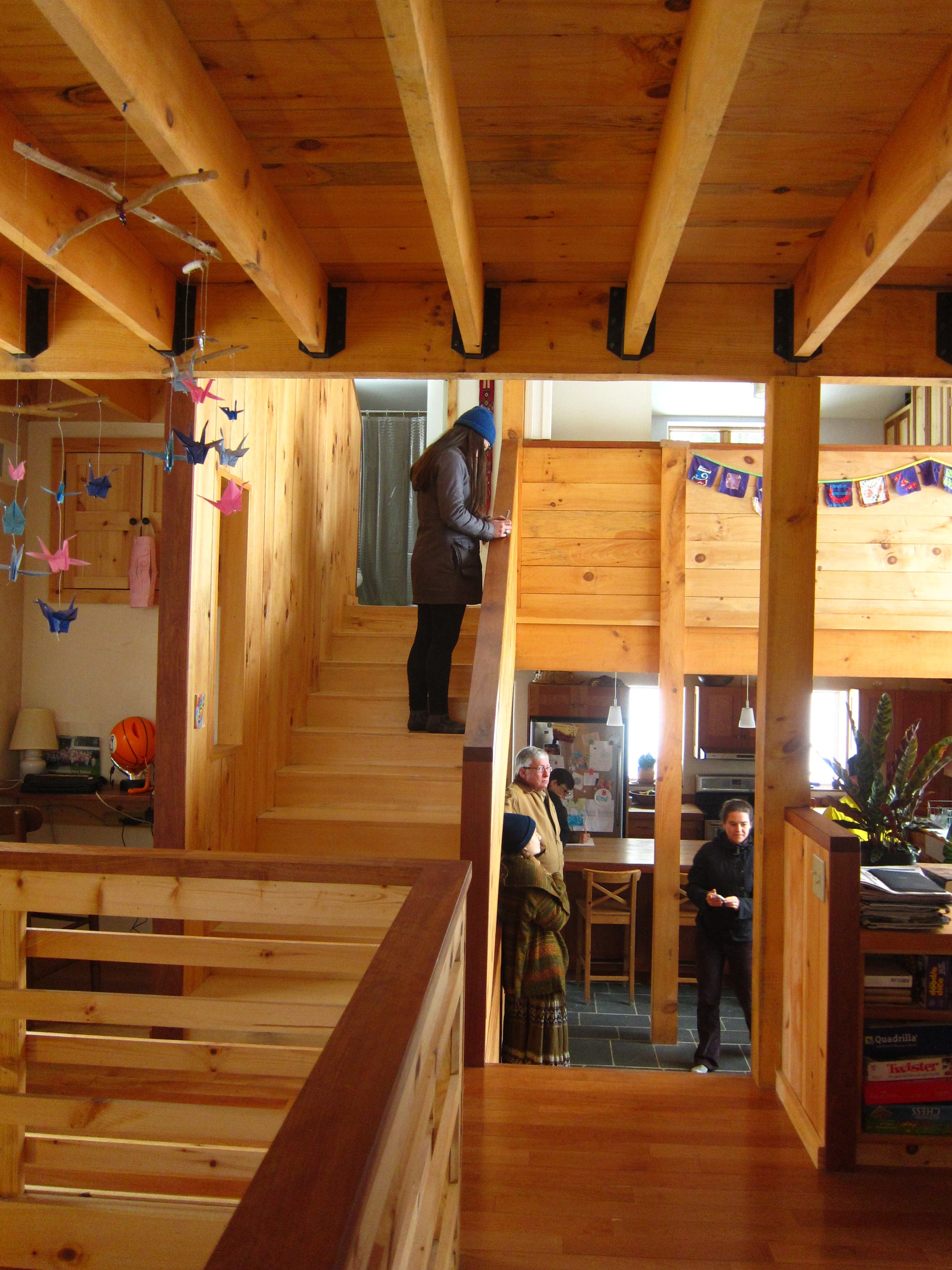
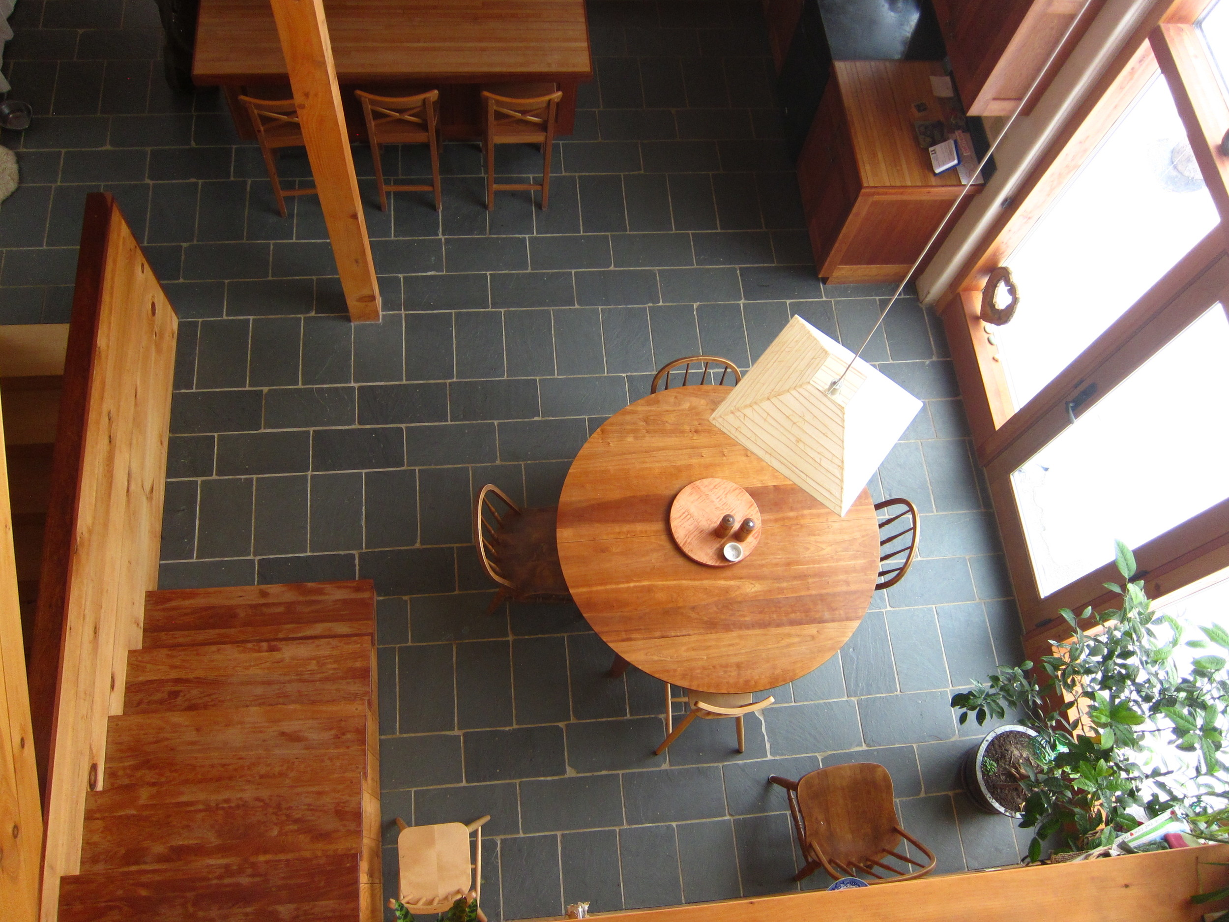
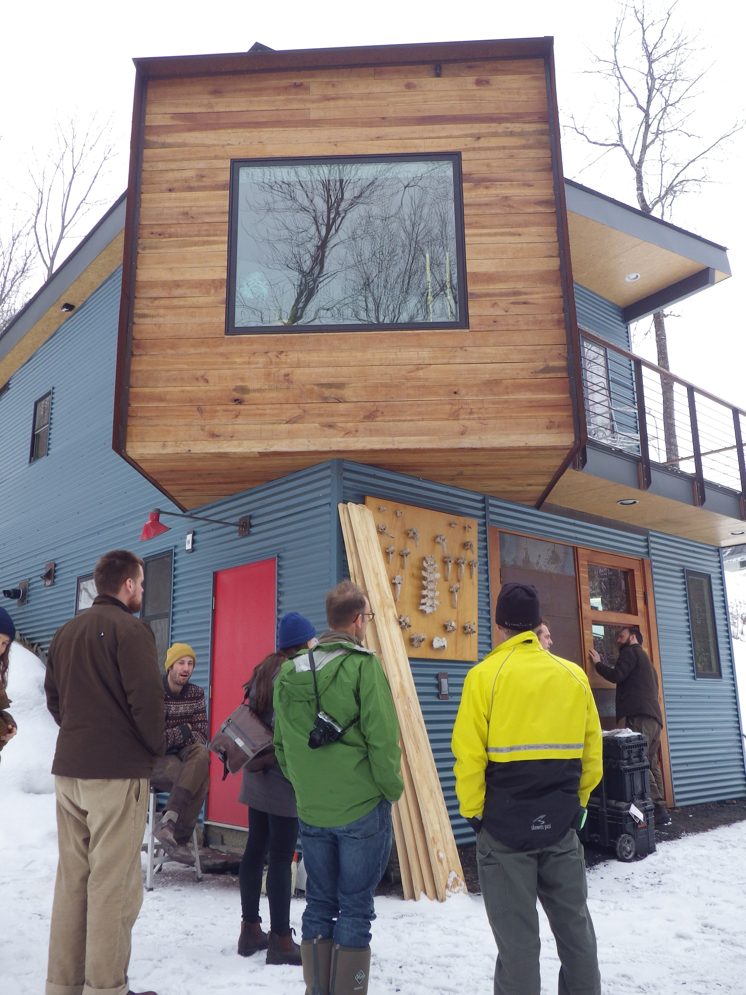
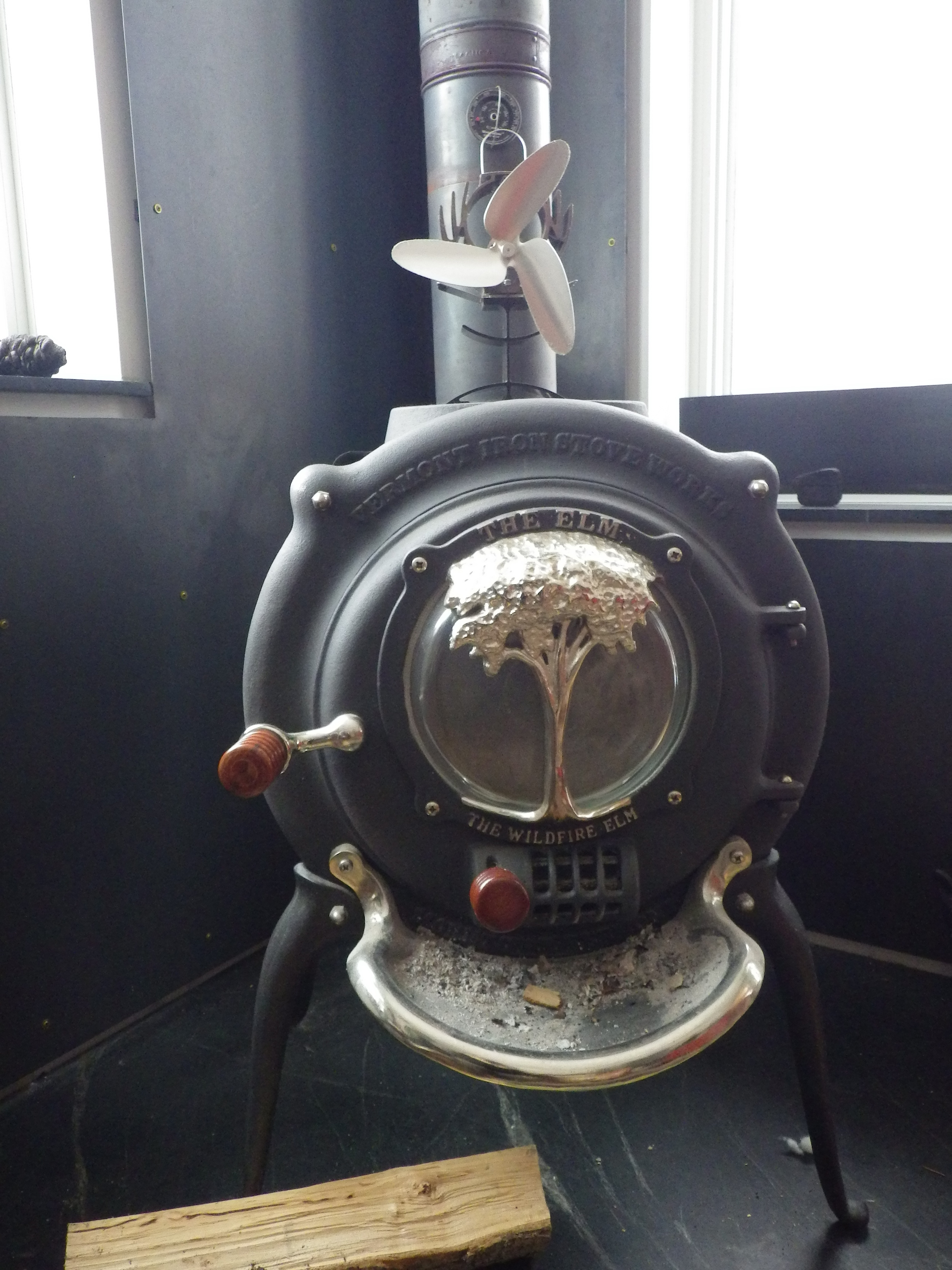
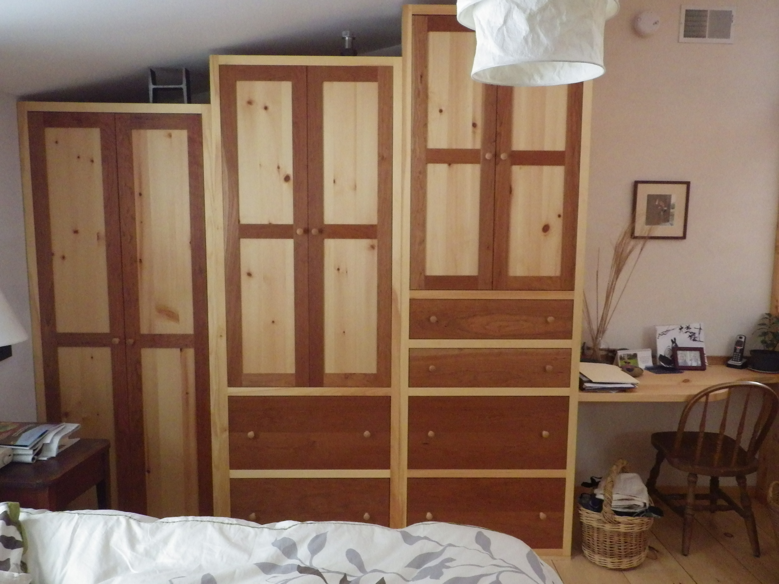
 We're about to begin our third day of Yestermorrow's Less is More class, which is focused on small home design. The first two days had a similar itinerary: small home tours in the morning, afternoon design lessons, and evening presentation and studio time. (Today the high is supposed to be 17 degrees, so it's probably just as well our tours have wrapped up!)
In just two days we've had the chance to explore seven homes, ranging from 200 to 2000 square feet. And while the larger homes are certainly not tiny (and I wouldn't consider them small either), they did offer good ideas for clever storage, creative work-arounds, and matching layout to program. They also provided good fodder for last night's discussion about design concepts that make small spaces seem larger. We now have good examples to point to as we discuss the strategies we're using in our own small home designs. This group of students has been asking great questions and they do a wonderful job working together to understand the various considerations and trade-offs when designing a small space. I'm looking forward to seeing their designs evolve!
They've already begun exploring layouts both in our life-size mock up and on trace paper. Today we'll continue the process with elevations and sections.
