February is upon us and it’s amazing to think that in just two short weeks I’ll be winging my way across the country to teach Tiny House Design at Yestermorrow! Tiny House Design is a long-weekend course that provides oodles of info and inspiration for people to dream, design, and draft up tiny or small homes of their own.
2019 Recap & 2020 Look Ahead
Tiny House & ADU Design Workshops in Feb at PCC
Winter is a great time for your design process if you'd like to get your project launched this coming spring or summer.
This Winter Term I'm teaching two fun weekend design classes through Portland Community College:
- February 10-11: Accessory Dwelling Unit (ADU) Design Course
- February 17-18: Tiny House Design Course
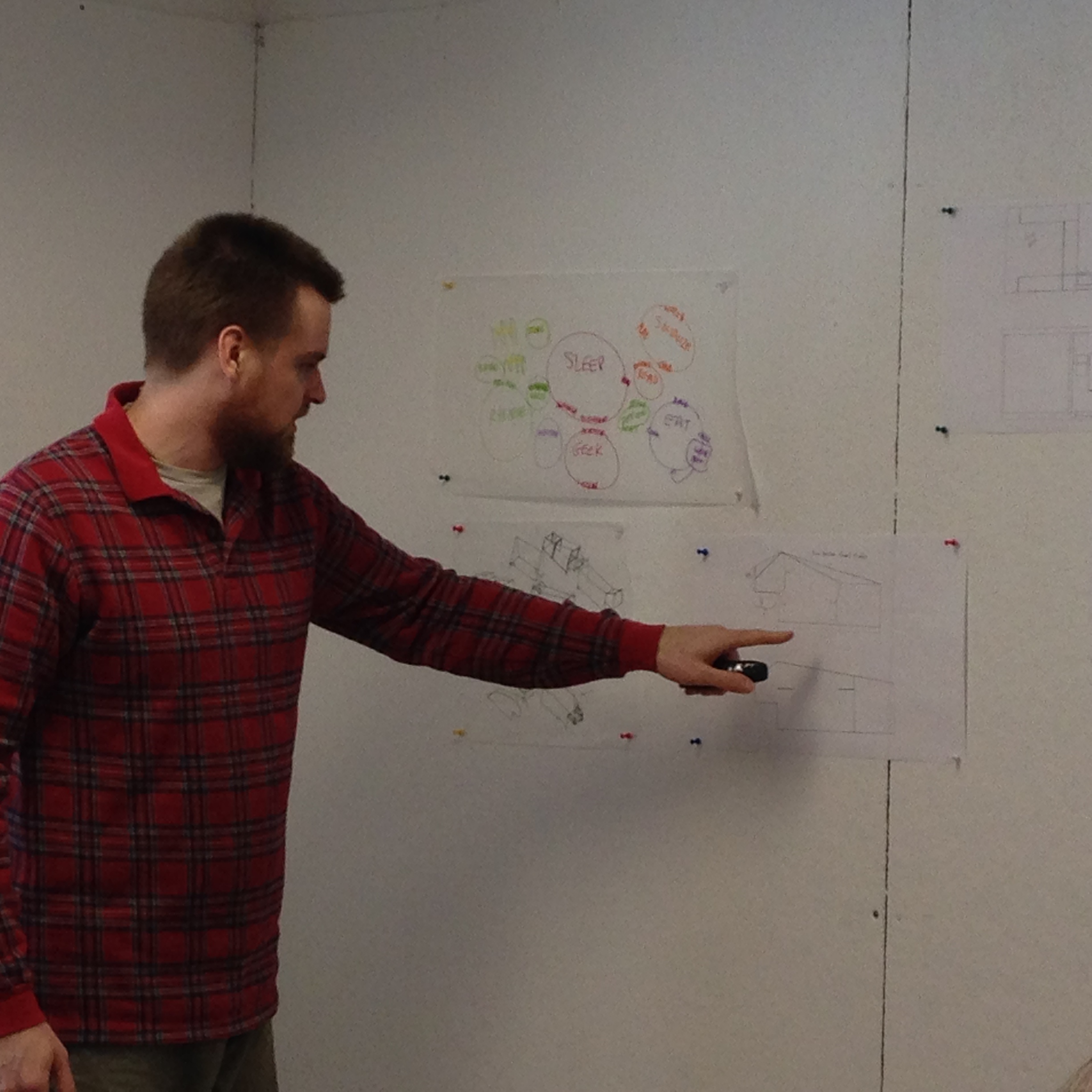
In these intensive two day workshops we cover many of the considerations for designing a small space, visit with special guests who have created ADUs or tiny homes (respectively), and go through a set of design exercises to help you develop a design of your own.
T42 Materials Palette
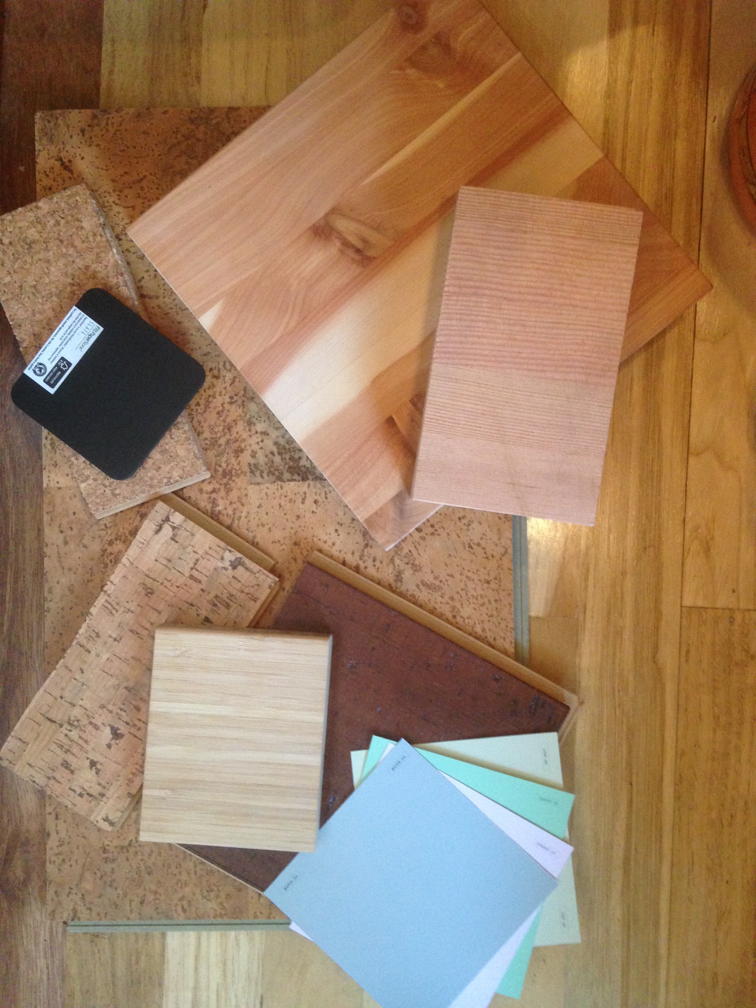 Over the past couple of months Isha and I have slowly developed a materials palette for our tiny house, T42. The past couple days we made great progress when build blitzer Sonja (who is, thankfully, also a sustainable materials geek) joined me to scout for finish materials. We headed out with our trusty color palette mug in hand. Let me explain...
I really enjoyed developing The Lucky Penny's Materials Palette, and Isha likes my little house, too, so he's trusted me to come up with a scheme for the new house. It's been fun finding the intersection of our preferences. I tend to be drawn to jewel tones and I love rich, complex pastels. I'm particularly fond of the purple and green combination. Meanwhile, Isha loves blue - ALL the blue - which I've never been particularly wild about. He's especially fond of cobalt. Luckily, we landed on an awesome scheme when I remembered a set of mugs I had when I lived in Walla Walla. I'd picked them up from Clay in Motion, a family-owned pottery studio in Milton-Freewater, OR and I'd loved them to pieces (literally!) over the years. So the last time Isha and I went to Walla Walla I took him to Clay in Motion and we picked up a set of mugs in their Mossy Creek scheme. It's a lovely minty green base with a vibrant lilac secondary and a cobalt accent. There are also thin ribbons of a lighter blue and a darker green. It ties our favorite colors together beautifully!
On Wednesday it was drizzly so Sonja and I hung out at a coffee shop, researching materials and making phone calls regarding sourcing, lead times, and availability. After I'd shown Sonja our SketchUp model and some of the items we're considering, we chose some items to investigate. Sonja found a few great visual examples of the materials scheme we're exploring for the exterior of the house. The cedar siding with cedar window frames against the black of our fiberglass windows should look really sharp with our zincalume roof!
We also explored interior wall coatings and discovered the clay plaster paint I was excited about won't work on our OSB substrate. I'll plan to use that for another house one of these days... Meanwhile, the milk paint Sonja introduced me to is very cool but cost-prohibitive for the amount of wall space we need to cover. So we landed back on Colorhouse Paints, which I used for The Lucky Penny. Colorhouse Paints are eco-friendly, solvent and VOC-free, and the company is local and woman-owned! We narrowed down the colors on Wednesday just looking at the colors online, which prepared us for our scouting trip on Thursday.
On Thursday, Sonja and I spent the entire day on a materials scouting field trip to investigate flooring and countertop options. Our day started at Green Depot where we explored interior primer and paint and honed in on some fabulous Colorhouse hues. (We're inclined towards a pale green for our long walls, a light lilac for our studio, and a silky blue for our bathroom.)
Then Greg walked us through all of these awesome green products:
- Sealer for our exterior trim: We're leaning towards OSMO One Coat HS because this European formulated product line covers in one application.
- Cork, bamboo, and linoleum flooring options: We're considering recycled glass tile for the bathroom and entry because it's easy maintenance, there are lots of cool design opportunities, and it's durable and hard-wearing. We're also excited about cork for the kitchen, living room, and studio because it's lightweight, insulating (yay for warm on the feet!), resilient, cost-effective, and looks super cool!
- Paperstone and butcherblock countertops: Both exciting options! The "slate" colored paperstone is regionally manufactured and would look really sharp with our black window frames! The butcherblock countertops are locally (and minimally) manufactured by Sustainable Northwest Wood and the juniper and fir are particularly lovely!
Greg sent us home with some samples on loan since I've found it's important to touch these materials and hold them next to each other to really get a sense for how it will come together. And, of course, I wanted Isha to be able to decide which ones he likes best, too!
Next we went to Bamboo Revolution where we talked with Ben whom I worked with on the Breathe Building project. He explained that their densified bamboo probably isn't the best bet for a tiny house floor because it's so heavy. But I fell in love with the idea of using their 3/4" bamboo for our countertops and potentially our desks, too. It's one of our lighter weight options, it comes in a thin enough profile that it will help make the counters more Lina height, and it has a fabulous banding pattern on the exposed edge! At $200 for a 4'x8'x3/4" piece of bamboo plywood, it's also a quarter the price of the Paperstone and a third of the price of the local butcher block countertop! Talk about an easy decision!
Our next stop was Rejuvenation where we got inspired by all the beautiful hardware and lighting options. We popped into Sustainable Northwest Wood to get pricing and lead time info from Ryan (whom I also worked with on the Breathe Building project). The wood butcher blocks are not the best option for this tiny house because of the weight, the thickness of the material, and the cost, but ohmygoodness do I ever want to use their juniper and madrone butcher blocks for a kitchen someday! Simply stunning!
Then we were off to EcoFloors where David walked us through cork, linoleum, and HydroCork flooring options as well as an alternative brand for the bamboo countertops. We liked one of the cork flooring options quite a bit and it was less expensive than the other one I'd particularly liked from Green Depot, so we brought home a sample of that, too. We learned that the click Marmoleum products don't work well in a steamy environment like a bathroom, so that helped nudge me further towards using tile for the bathroom and entryway.
Eventually we headed south to Sherwood where we visited with Micah at Lakeside Lumber to learn about exterior trim and siding options. I have a lot of noodling to do on this one since each decision about our siding makes a big difference for the look and feel of the house. We're trying to get a contemporary look at a great price and even I am curious about what we'll decide! Finally we made our way to Building Material Resources where we looked at doors (so many possibilities for our pocket and track doors) and cedar siding (a couple cool options here, too!)
It was fun showing Isha (and Jake and Karin) all of the samples we'd picked up during this epic scouting day and sharing everything we'd learned along the way. Fortunately, Isha likes my favorite, too. It's fun to be honing in on our interior finishes and getting a better sense of the look and feel of T42!
A Tiny Announcement from Lina & Isha
Now that the Meyerhofer's Tiny House, Cilantro Poncho, has sprung to life in Tucson, AZ through last week's build blitz, Isha and I have decided it's time to make a tiny announcement of our own.
As many of you know, last summer I fell in love with The Guy Next Door. For the past nine months Isha and I have been living in his and hers tiny houses at Simply Home Community.
Now Isha and I are expecting... that our baby will be here with us in about 9 months. And yes, we already know what it's going to be!
We're making a Tiny For Two!
We're affectionately referring to it as T42 or "tea for two" for the time being, though like most expectant parents, we're still considering names.
This is, of course, what sometimes happens after a bad case of Trailer Lust.
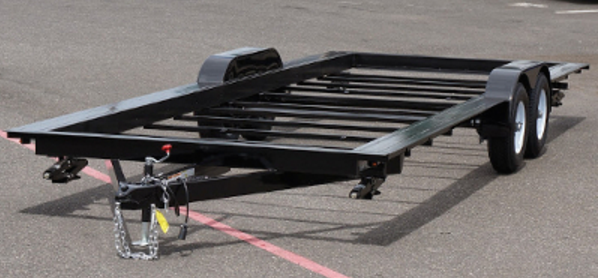
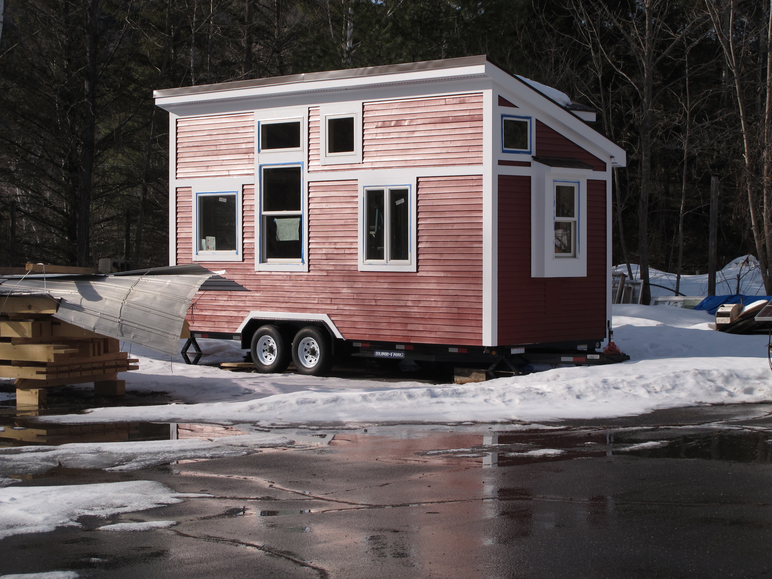
Isha and I placed the order a couple weeks ago for our 24' PAD Series Tiny House Trailer from Iron Eagle Trailers in Fairview, OR. (Yes, we even know how big it's going to be when it arrives. In fact, we were specific about that!) Rob built the trailer for my vardo, The Lucky Penny, so we know it's going to be a great foundation for our new little house. The trailer should be ready by the end of March and we'll begin building in April. We're deep in the design phase right now and we're looking forward to revealing the design soon. We've been Window Shopping Again and looking forward to Ordering Our Tiny House SIPs Kit. If you'd like to help out with the build, please get in touch.
Stay tuned for more! We're rather giddy and excited to share our new little house with you!
Lina's Tiny House: The Lucky Penny
For those of you new to The Little Life, welcome! My name is Lina Menard and I live in a tiny house called The Lucky Penny. I designed and built the Lucky Penny in 2014.

This profile will introduce you to my lil' house. If you'd like to see more photos and articles about my house, read Lucky Penny's Public Debut. If you have questions, please be sure to take a peek at my Frequently Asked Questions and if your question isn't addressed there, please contact me. If you want to see a video tour, please check out the Lucky Penny Tiny House Tour by Jenna and Guillaume of Tiny House Giant Journey. You can also check out other posts about The Lucky Penny on my blog.
Fast Facts
- Name: The Lucky Penny
- Location: Simply Home Community in Portland, OR
- Location Type: Tiny Cohousing Community (three tiny houses act as detached bedrooms in the backyard of a single-family home)
- Setting: Urban
- Designer: Lina Menard of Niche Consulting LLC (yup, that's me!)
- Builder: Lina Menard & Friends (I hosted work parties most weekends!)
- Plan Set: To Be Released Soon
- Number of Full-Time Inhabitants: 1
- Number of Part-Time Inhabitants: 1
- Pets: Raffi, 10 year old red Devon Rex tabby cat
Size Details
- House Width (Exterior): 8'-4" (100")
- House Width (Interior): 7'-4" (88")
- House Length (Exterior): 14'-9" (177")
- House Length (Interior) = 13'-9" (165")
- Exterior Square Footage: 123
- Interior Square Footage: 100
- House Height: appox. 12'-6"
- Weight: Unknown
Construction Details
- Style: Gypsy Wagon
- Roof Shape: Vardo (curved)
- Foundation Type: Single 5000 # Iron Eagle Vardo Trailer with side extensions, welded-on stabilizing jacks
- Construction Type: SIPs (Structural Insulated Panels)
- Insulation Type: EPS (expanded polystyrene foam)
Systems
- electric point-of-use water heater
- electric space heater (Oct-Mar)
- mini-fridge without freezer (April-September)
- one-burner induction cooktop
- convection toaster oven
- mini chest freezer
- kitchen sink
- bathroom shower
Sustainability Features
- salvaged door, windows, and finish materials
- electric-only appliances
- SIPs construction for energy-efficiency
- liquid-applied water resistant barrier for air sealing and energy-efficiency
- all LED lighting
- energy-efficient appliances
- low-VOC paints, stains and sealants
Budget
- Total Budget: $25,000
- Total Build Cost: $24,250
- Building Materials: $14,000
- Car & Truck Rental: $2,750 (I don't own a car, so I rented cars and trucks for my build)
- Build Space Rental: $2,250 ($250/month for 9 months)
- Volunteer Meals: $1,500 (I ran work parties most weekends and provided coffee, continental breakfast, snacks, a picnic lunch and for those who stuck with me till the end, dinner!)
- Furnishings: $1,500
- Contracted Labor: $1,250 ($750 roofer, $300 welding for flip-up porch, $200 electrical consultation)
- Appliances: $1,000
- Estimated Sweat Equity: $16,000 (800 hours at $20/hour*)
- Total Value: $40,250
Less Is More 2016 Wrap Up
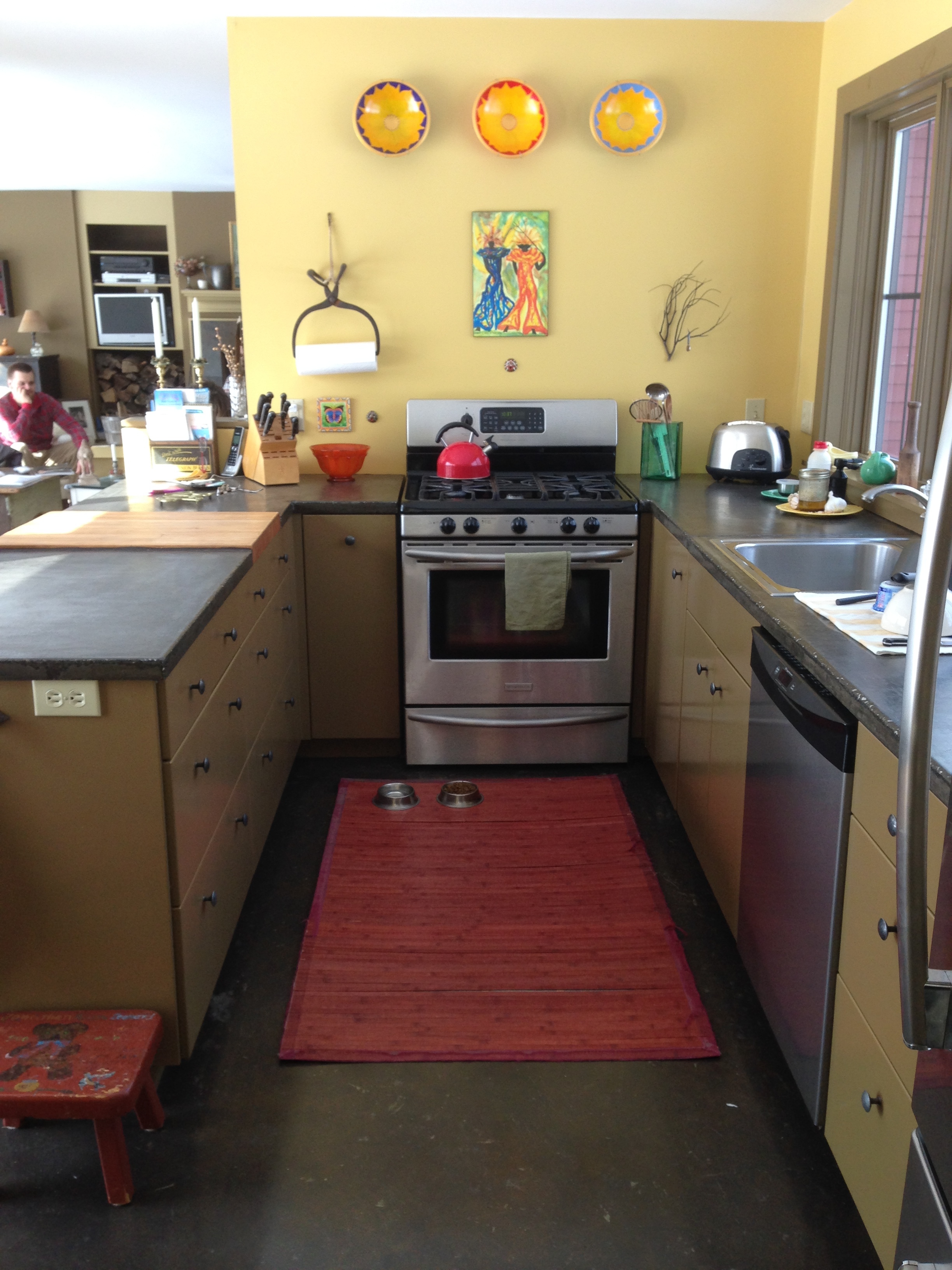
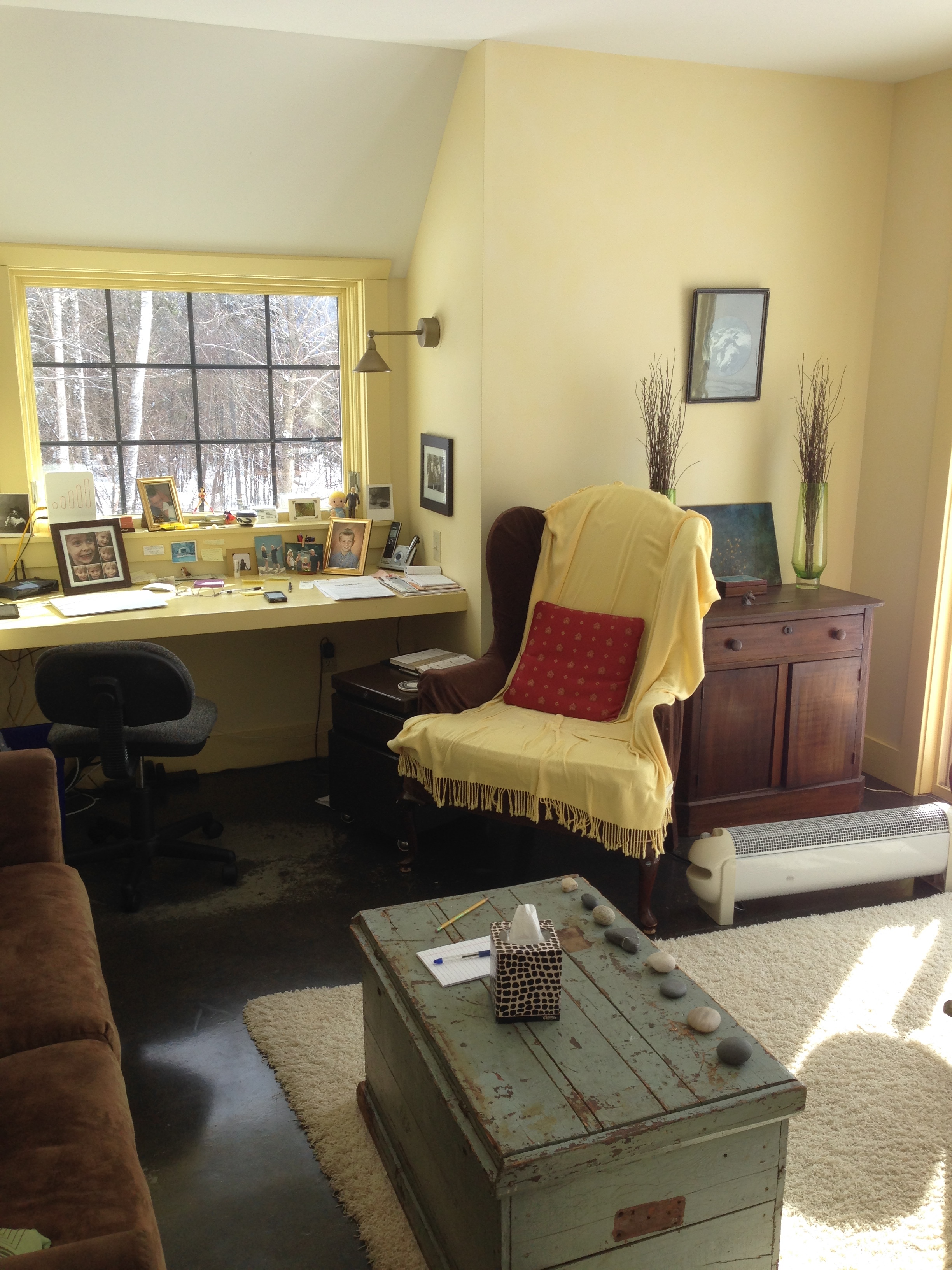
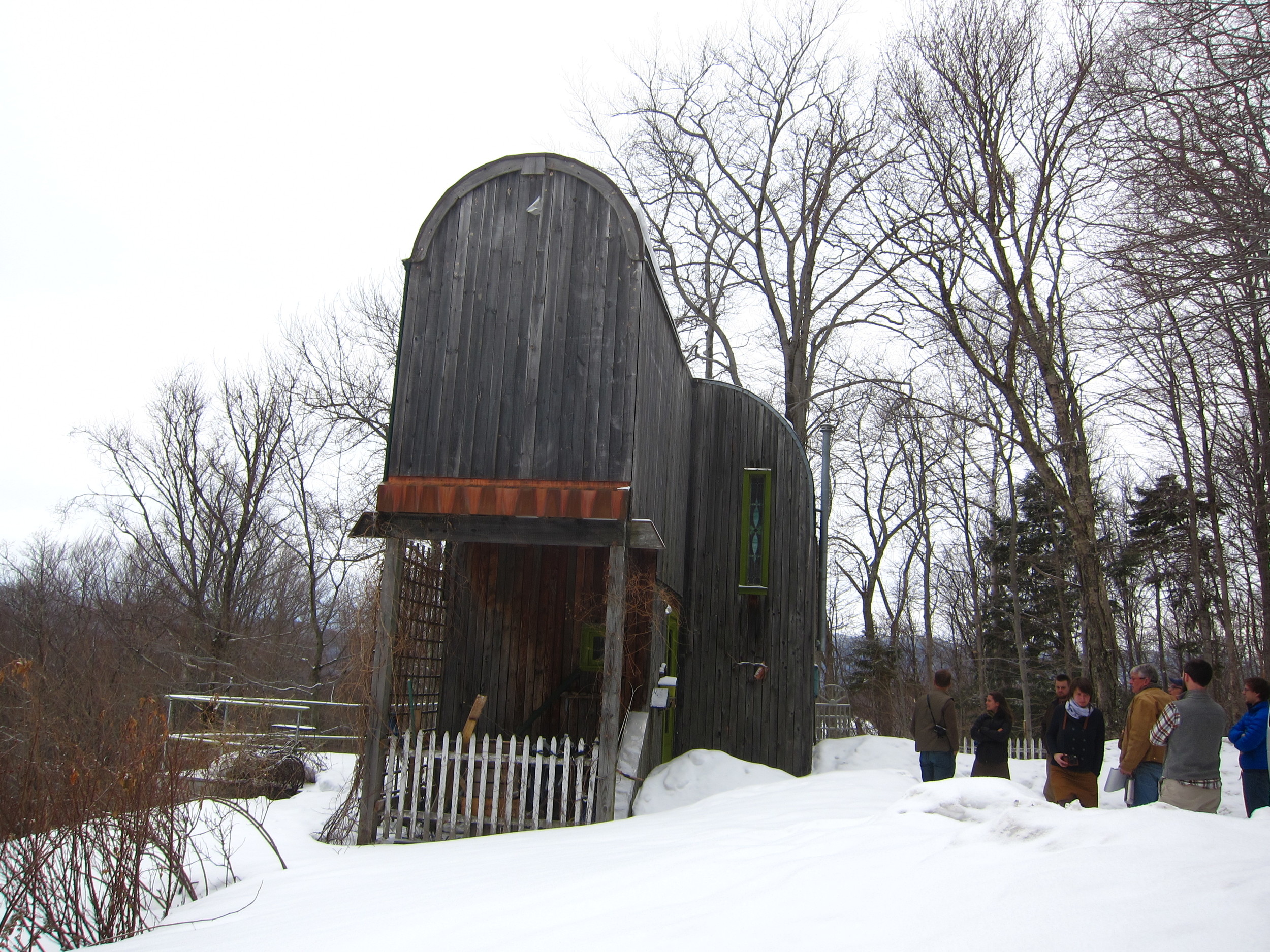
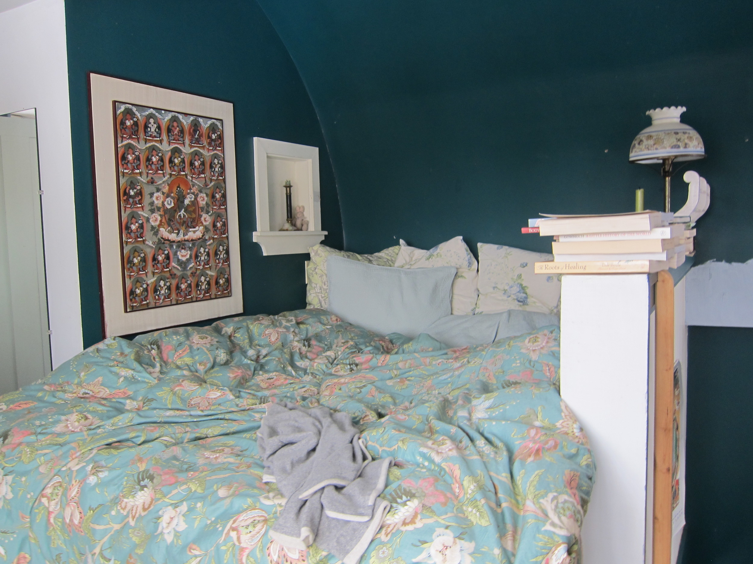
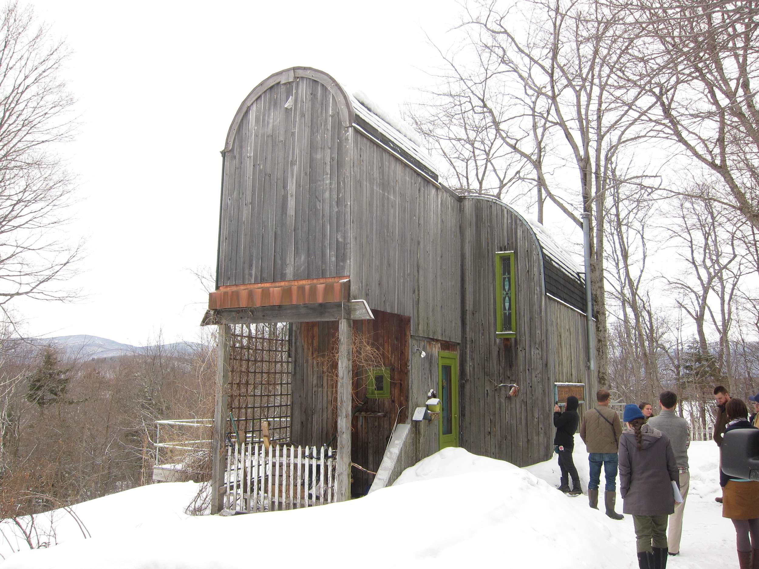
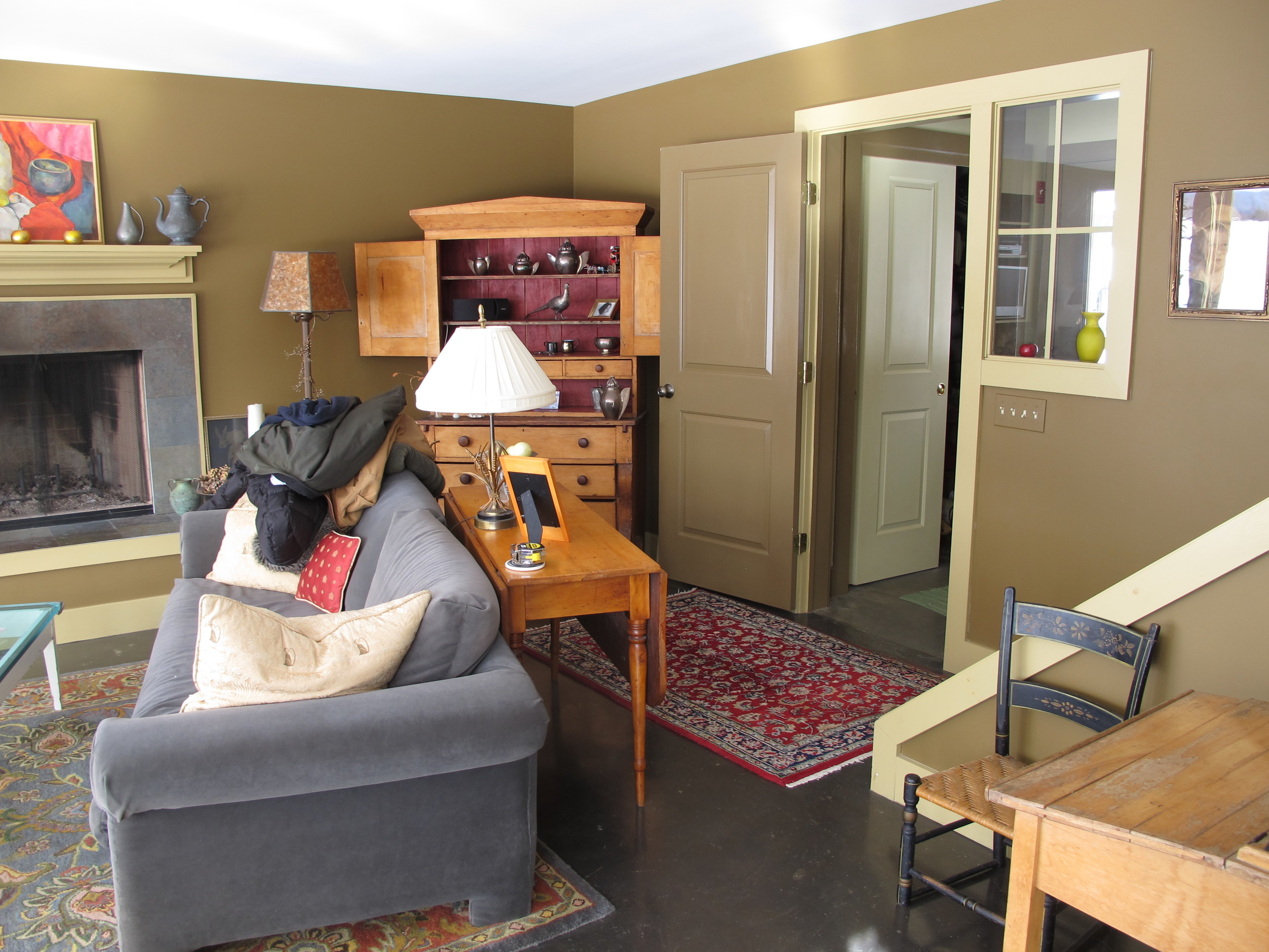
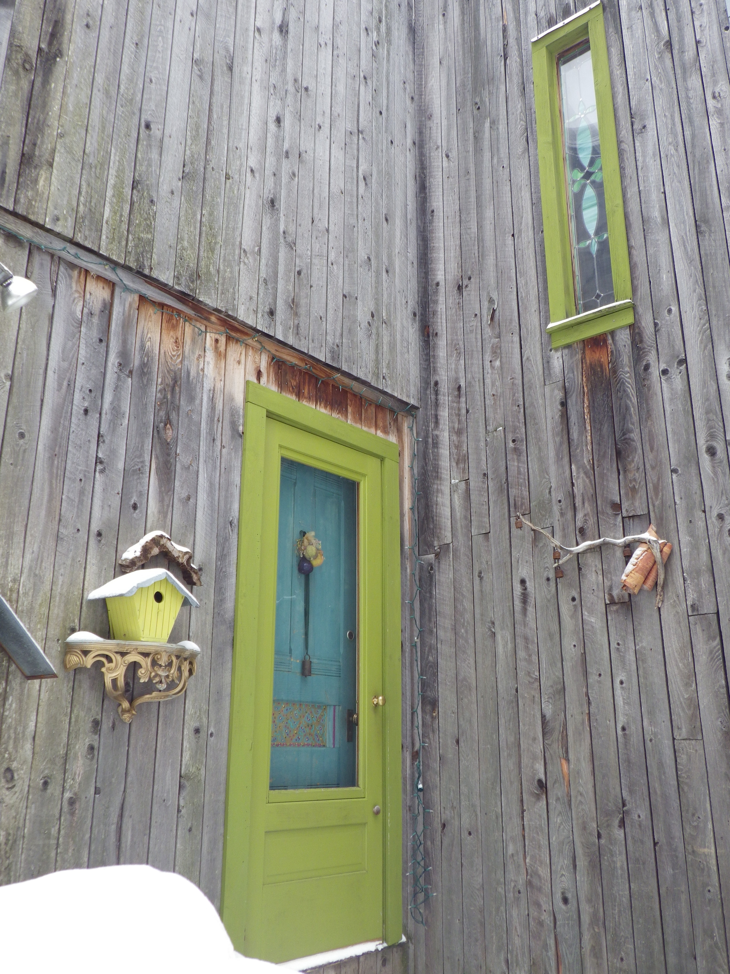
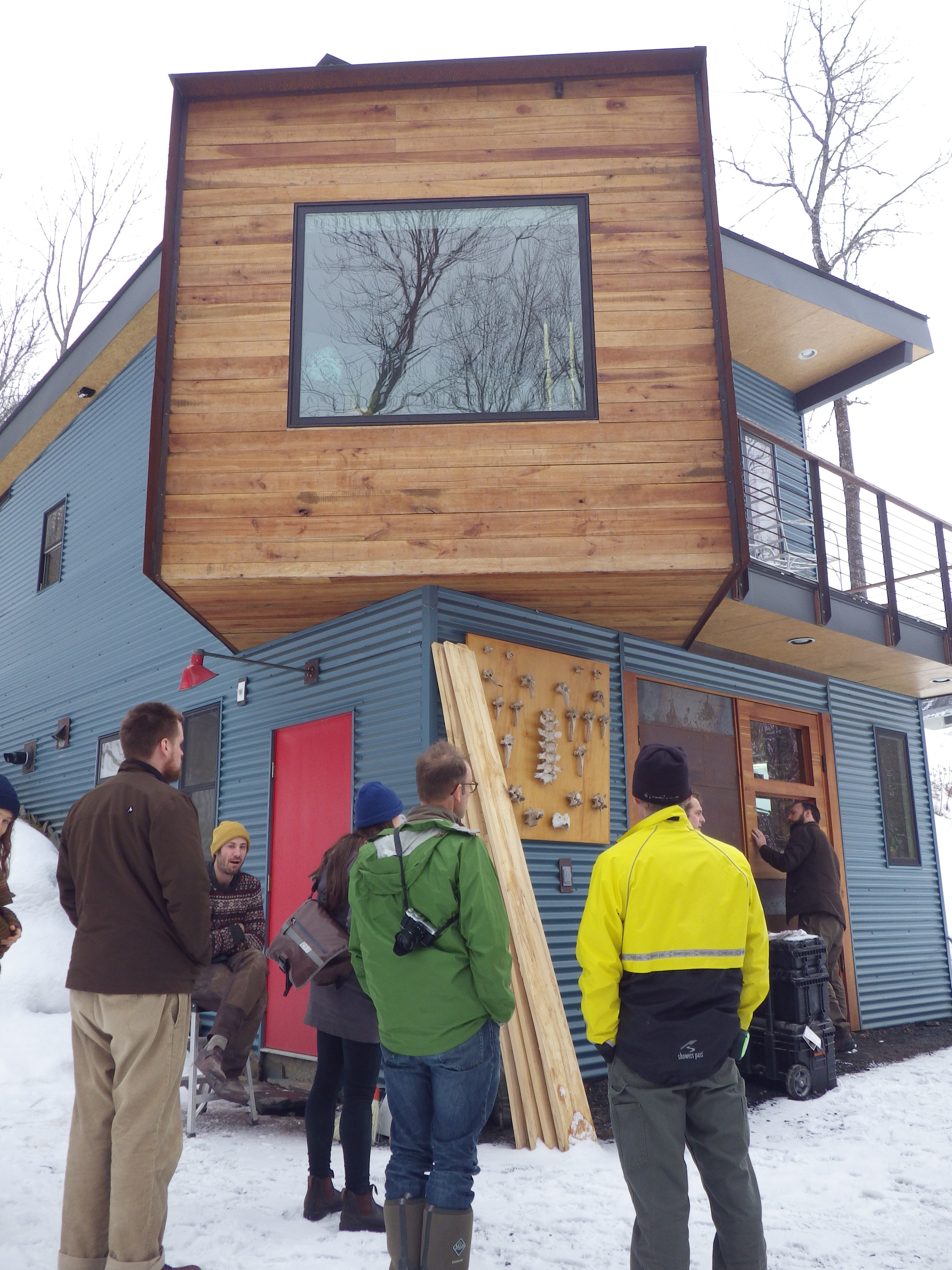
 It was great fun Kicking Off 2016 with Small Home Design by teaching Less Is More at Yestermorrow. Monday and Tuesday we went on field trips to small houses in the Mad River Valley and Montpelier. We got to see five little houses this year, ranging in size from about 120 square feet to 1700 square feet. All five of these houses were owner-built, which was neat because we had the opportunity to talk to the homeowners about their challenges and successes. I had been to each of these small homes before, but I learn something new each time I visit, so that was great!
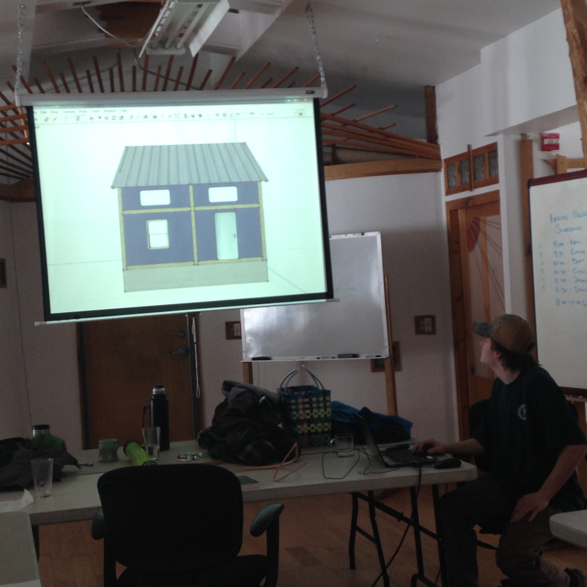
On Monday, Tuesday, and Wednesday Dave and I presented slideshows to share building basics and design tricks for small spaces. We asked the students what else they wanted to learn and ended up doing a crash course in building science, a presentation on toilet options, considerations for construction and finish materials, and sharing net zero energy information. We also introduced design exercises and drafting techniques.
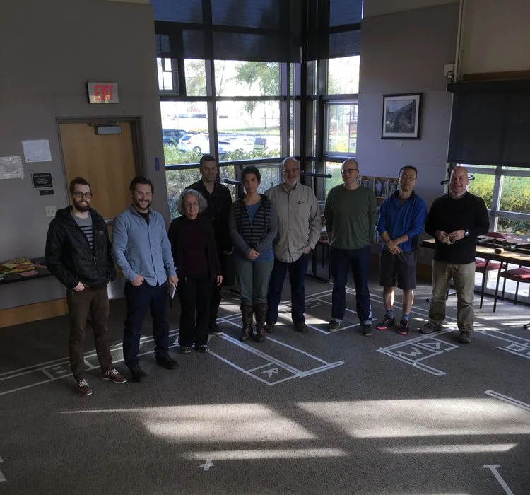
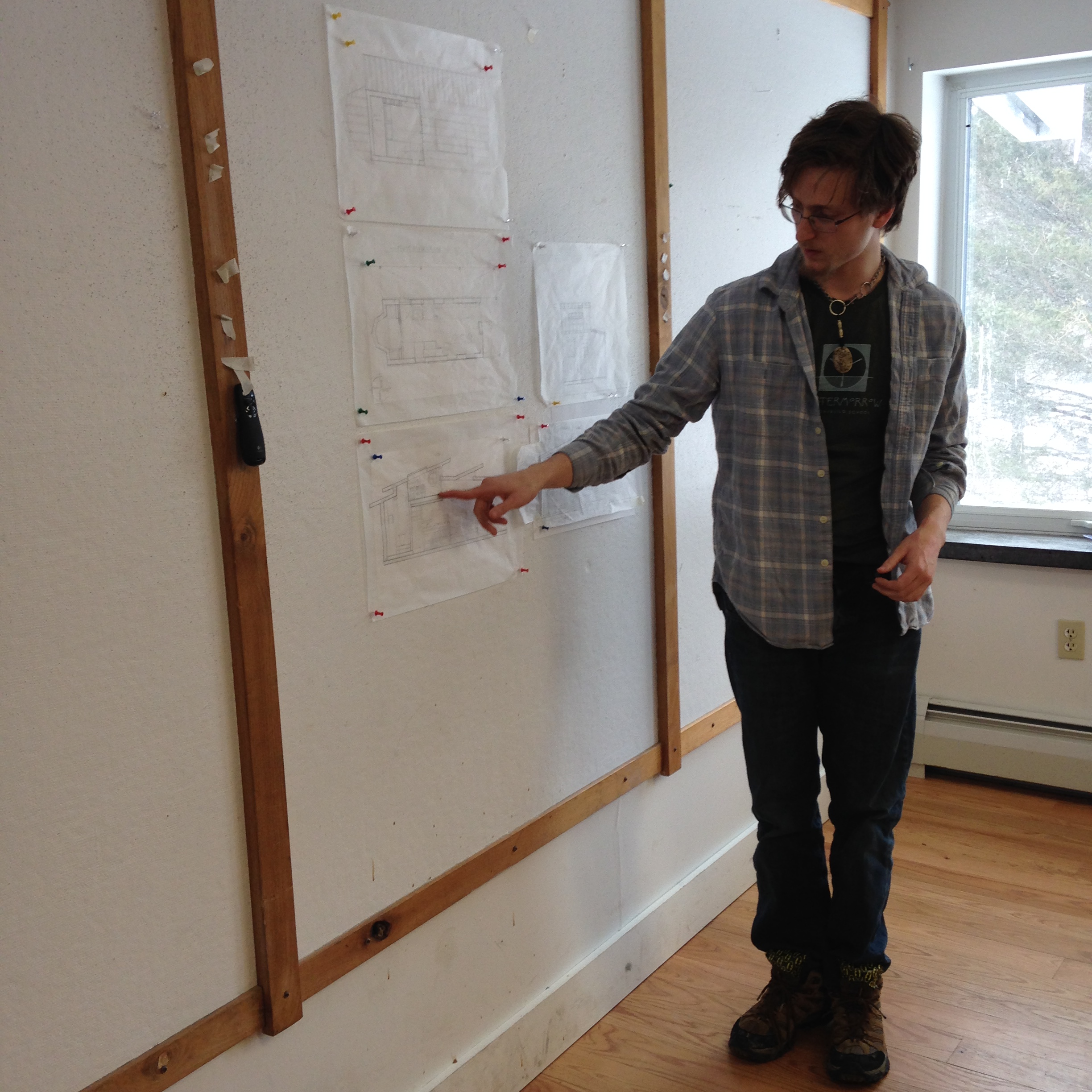
One of our activities was designing a tiny house together by taping it out on the floor. I was impressed by how many different considerations came up as the students deliberated the merits of putting the door in one location or another and selecting a roof style. They were excellent at weighing their options and thinking things through. It was fun to see students design exercises morph into their individual projects as their understanding and design skills evolved. (Photos forthcoming.)
On Thursday the students worked away the day designing their own small home projects, ranging in scale from a 200 SF tiny house on wheels to a 1800 ski house that can sleep 12. They presented their work on Friday to the class and our jurors, Paul Hanke and Kathy Meyer.
Other projects included:
- a small home with a movement studio for dance and aikido
- a little house inspired by medieval timber frame construction
- a Texan live-work space with a double roof for shading
- a small lakehouse to retire to
- a cabin in the woods with an impressive roof
- a round house with pop-outs
- a multi-generational home with a turret suite
It was fun to see students design exercises morph into their individual projects as their understanding and design skills evolved. And, of course, it was great to be back in Vermont and at Yestermorrow. This was my eleventh trip out there and it looks like I may have good reason to go back again this summer to help out with a Build Blitz. One of the students in the class is excited to build a tiny house on wheels and several other students are eager to help out. Stay tuned for more about that possibility!
Meanwhile, I’m scheming my next tiny house design workshop, which will be in Asheville, NC right after the Tiny House Conference. If you’re noodling through your tiny house design, mark your calendar for April 3-8th and Contact Me to be added to the list for more information!
Westermorrow Tiny House Design-Build
 On Friday we wrapped up the first ever Westermorrow class – a Yestermorrow Design-Build School course taught on the West Coast. The Tiny House Design-Build class, which has been offered just once a year in VT, has filled up so quickly recently (this past year’s class filled up in just 30 minutes!) that Yestermorrow decided to offer it again here in Portland.
What an amazing experience for all of us! Patti and Lizabeth road-tripped across the country to be here. Dee Williams came down from Olympia to co-instruct with us! And our students came from California, Utah, Virginia, New York, and Illinois. We even had a student join us from South Africa and another from Montreal, Canada! In fact, the only student who was actually from Portland was our client, Merek.
We set up in St. John’s, a neighborhood in North Portland, so that we were able to build at Green Anchors (where I built my own tiny house, The Lucky Penny). We had our studio space at The Colony. And half our class stayed at Caravan – The Tiny House Hotel where they were able to try on tiny living for two weeks while building and designing. Several of them said this was a great experience and two of the seven decided that maaaybe they don’t want to live in a tiny house after all. (They both ended up designing wee houses around 600 square feet - still small enough that they’d qualify as Accessory Dwellings here in Portland, OR and a fraction the size of the average home built in America today!)
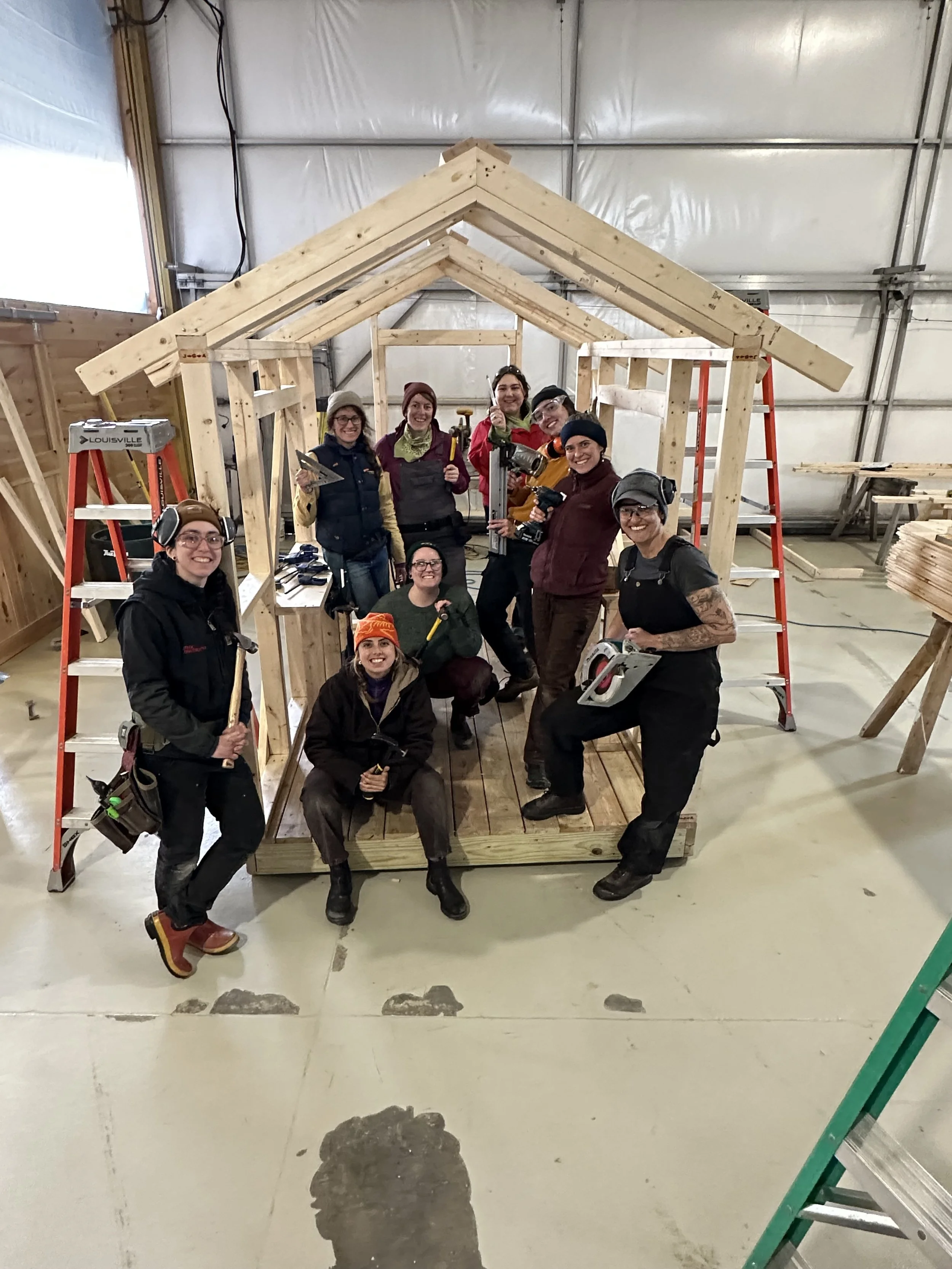
We started out our studio time with field trips and presentations covering everything from plumbing and electrical systems to regulations and interior design strategies for small spaces. In the field we started out with safety and tool orientation and then built sawhorses to practice measuring twice and cutting once. By the second week our students were shifting between the build site and the studio to move the house as far along as possible while also creating awesome tiny house designs.
There were definitely some differences between teaching the class in VT and OR. It was strange to not be on a residential campus where sleeping, eating, designing, and drafting are all just yards from each other. But it was also fun being in a more urban setting. I missed being on the scrumptious Yestermorrow meal plan, but it was fun exploring St. John’s eateries (the food carts, Proper Eats, Signal Station Pizza, Super Burrito Express, Big Kahuna’s BBQ, the baowry, etc.) And the second week, once people were comfortable with the area, I switched back to Simply Home’s Community Dinners, which are one of my favorite things!
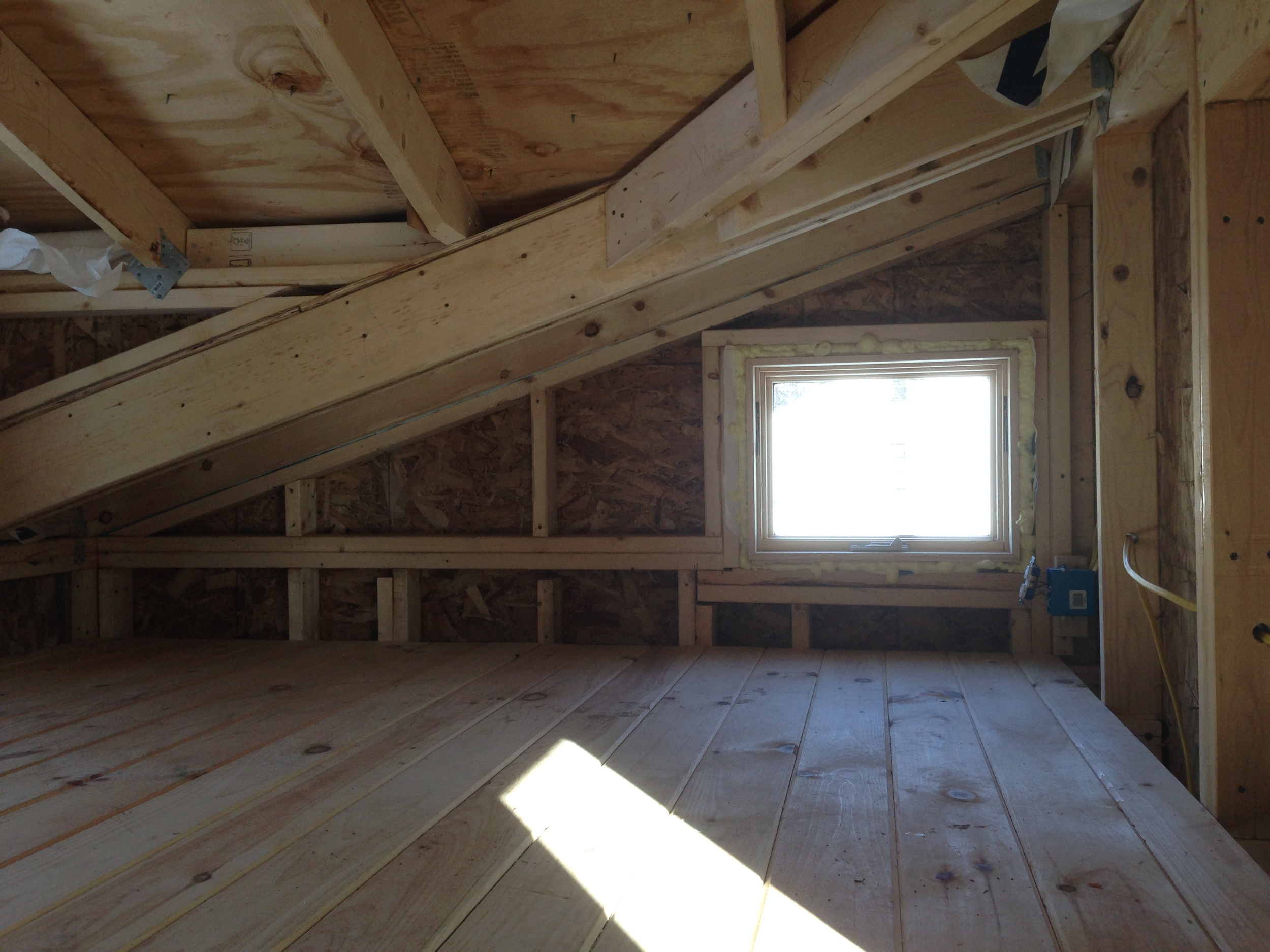
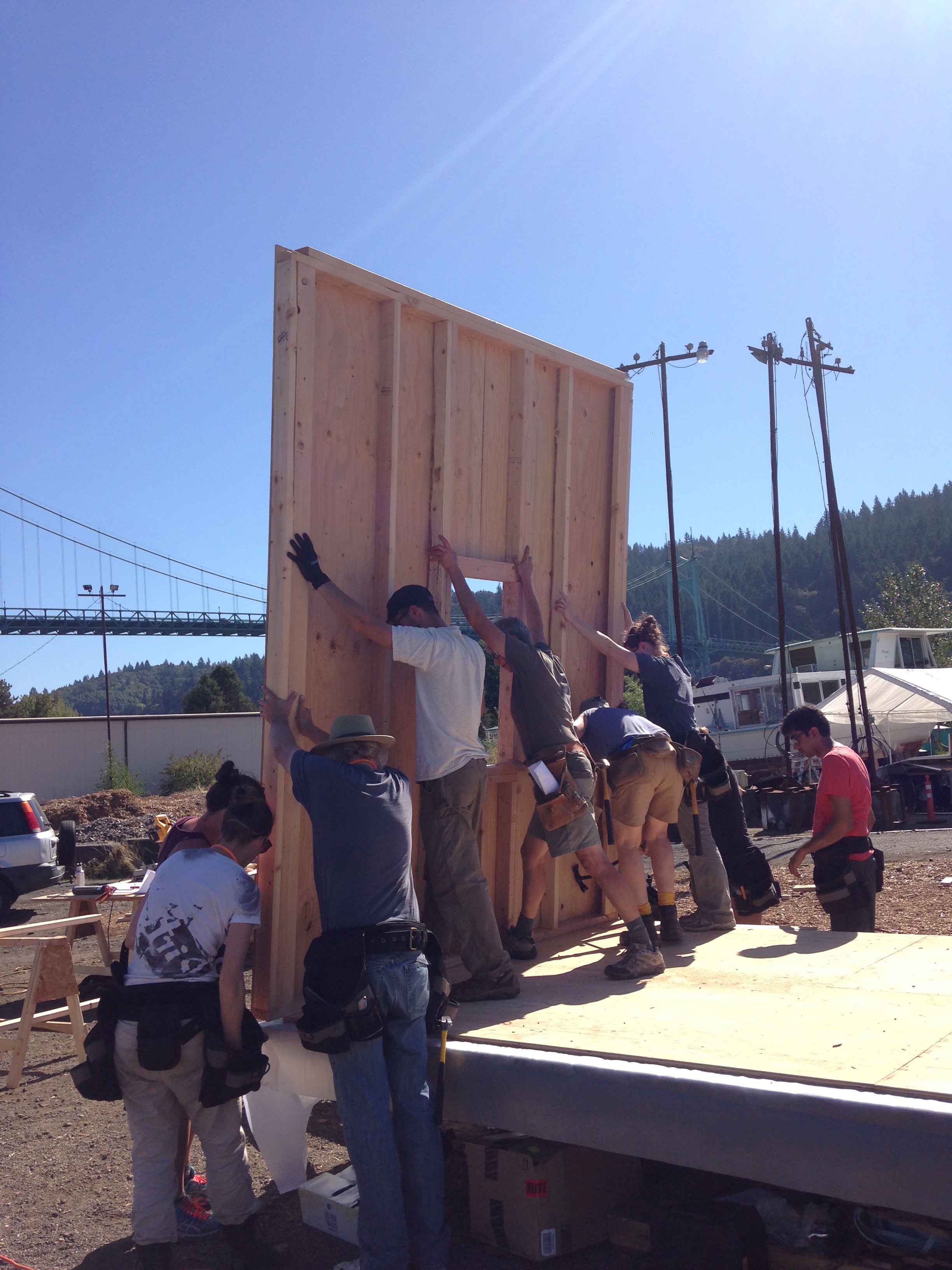
On the build site we constructed the shell of Merek and his partner Erin’s tiny house on wheels. Their little house has a ½ and ½ roof, meaning that part of the roof is shallower and part is steeper. This allows them to have plenty of headroom in the loft and a more interesting roofline. We nailed the framing together (apparently the Doug Fir we have over here is much harder than the spruce used on the East Coast – we bent a lot of nails as we practiced!) Over here on the West Coast it seems most tiny houses are glued and screwed together instead, so we weren’t aware of this difference! We got the walls framed, sheathed, and raised and the ridge beam, roof rafters, and the first course of plywood on the steeper pitched roof before we had to turn our attention to Presentation Day.
I LOVE Presentation Day! It’s always so inspirational to see what our students create with two weeks of tiny house design and build experience (and for 7 of our students this time the experience of living in tiny houses, too!) We had awesome designs this time around, including several tiny houses on wheels (with a huge variety of layouts and roof shapes and multi-purpose furniture) and a handful of clever ground-bound houses (including an off-grid cabin with creative sleeping for the whole extended family and a small home with space for motorcycles in the living room!)
It was an honor to co-teach with some of my tiny house heros: Dee Williams, Lizabeth Moniz, and Patti Garbeck. I’m appreciative of all the folks who helped make this happen, from Mark, Dan, Luke, and Katie at Yestermorrow, to Matt, Mark, and Kevin at Green Anchors and Rita and Dana at The Colony. I'm thankful that Merek and Erin entrusted us with the beginning of their little home. And I’m especially full of gratitude for our incredible group of 14 students for inspiring me all over again! I can’t wait to follow along on their tiny house journeys! Stay tuned!
Less Is More Presentation Day
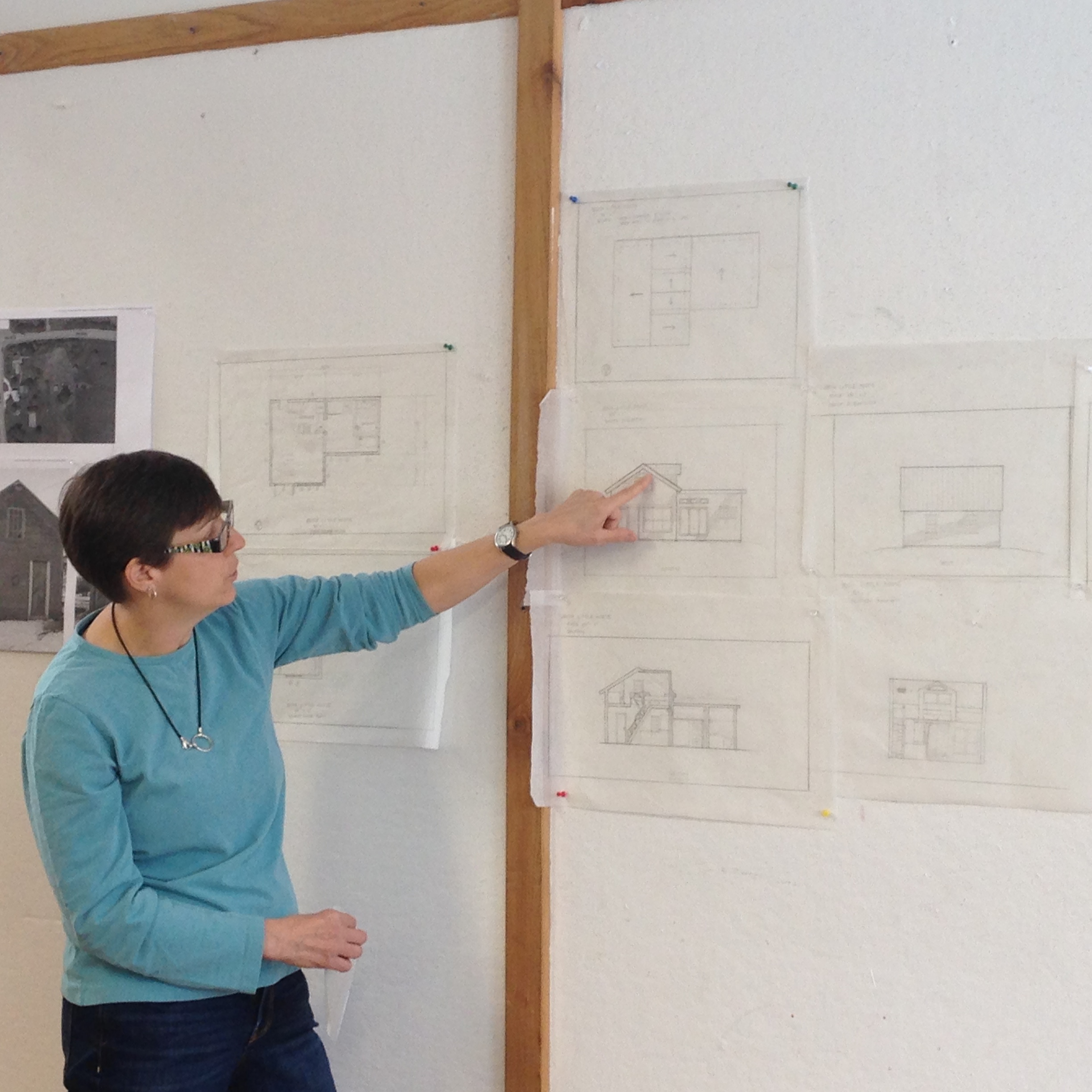
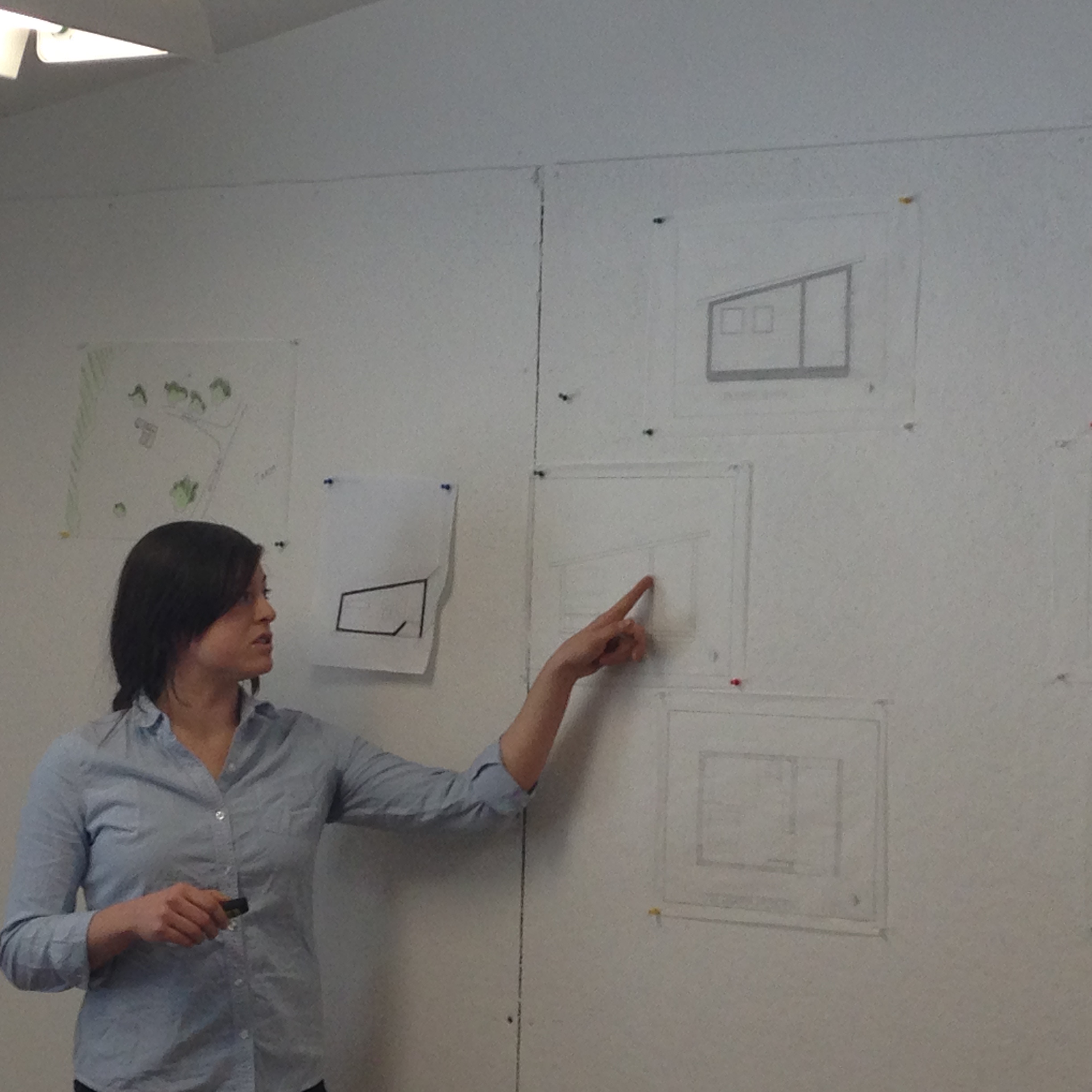
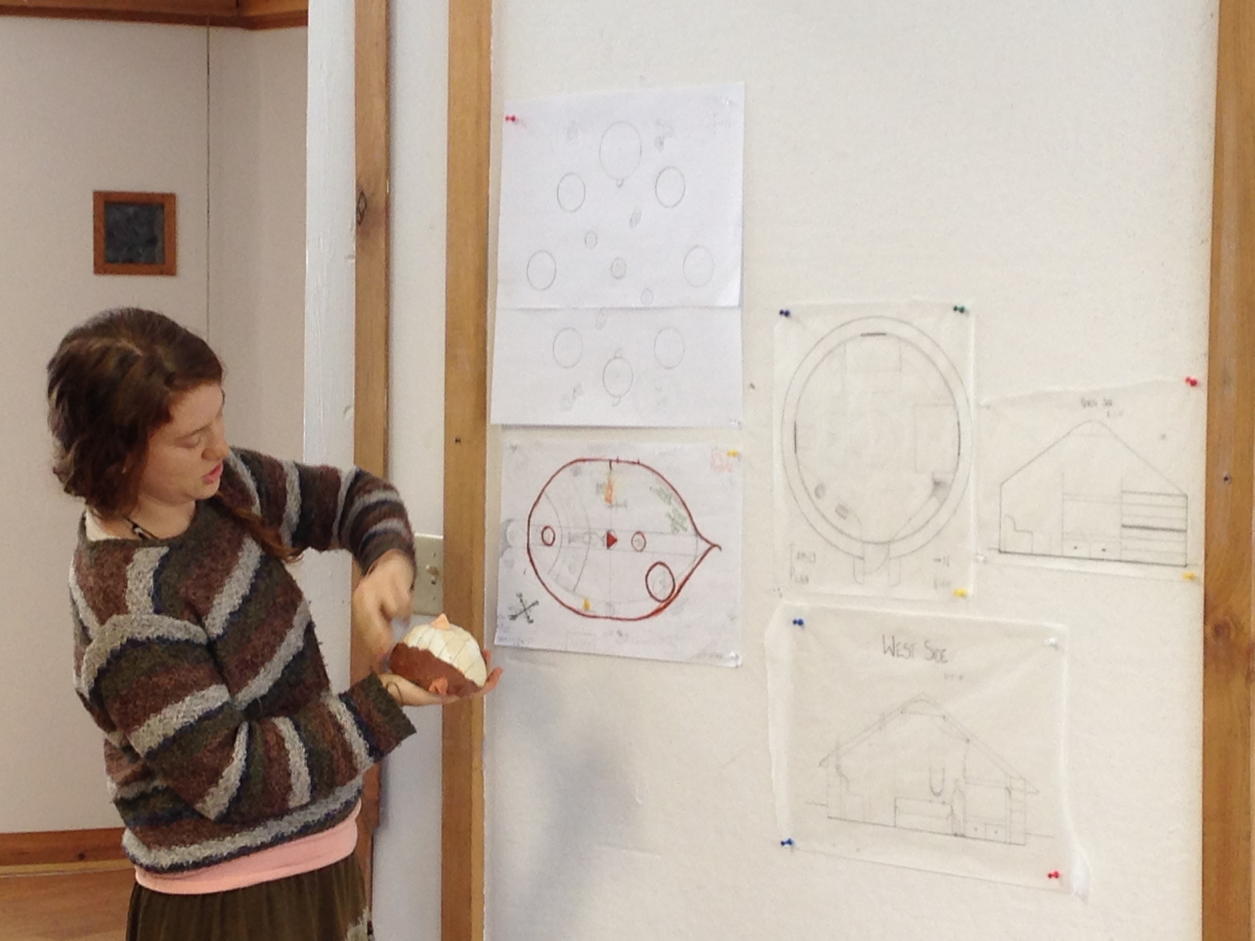
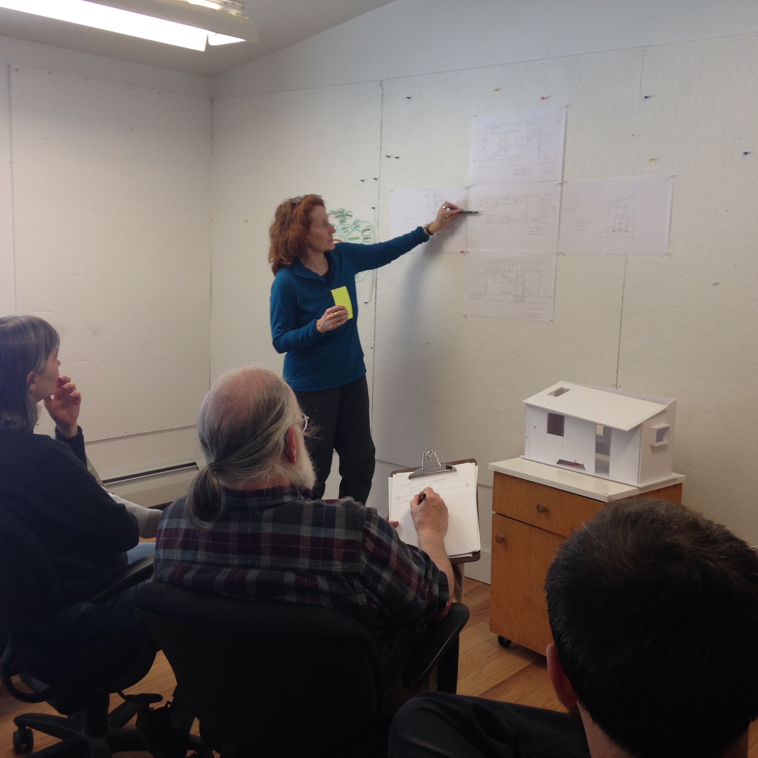
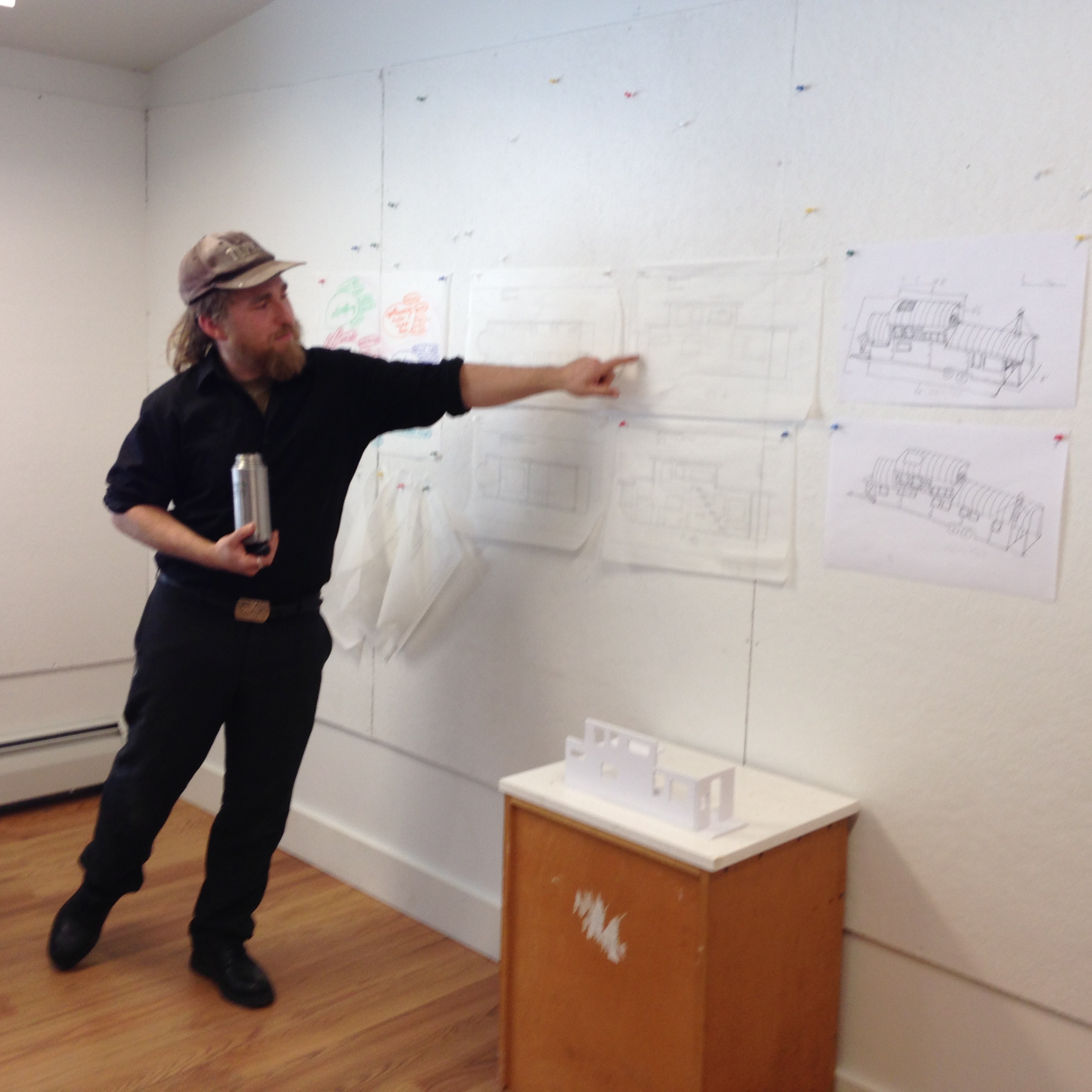
 Presentation Day at Yestermorrow is always a bit like Xmas morning for me. Dave and I posted our list on Wednesday evening, asking our students to incorporate context/site, floor plans, elevations, and sections and/or models into their Friday presentations. And we were up late with them on Thursday night. So it’s a little like sending a letter to Santa and then trying to stay up to catch him. (Several of our Less Is More students were still up at the eleventh hour when I called it a night!) But inevitably, some of the design magic happens after we’re fast asleep, visions of elegant details dancing in our heads. We never know exactly what we’ll find on the presentation board when the designs are pinned up of the following day, so it’s a wonderful surprise!
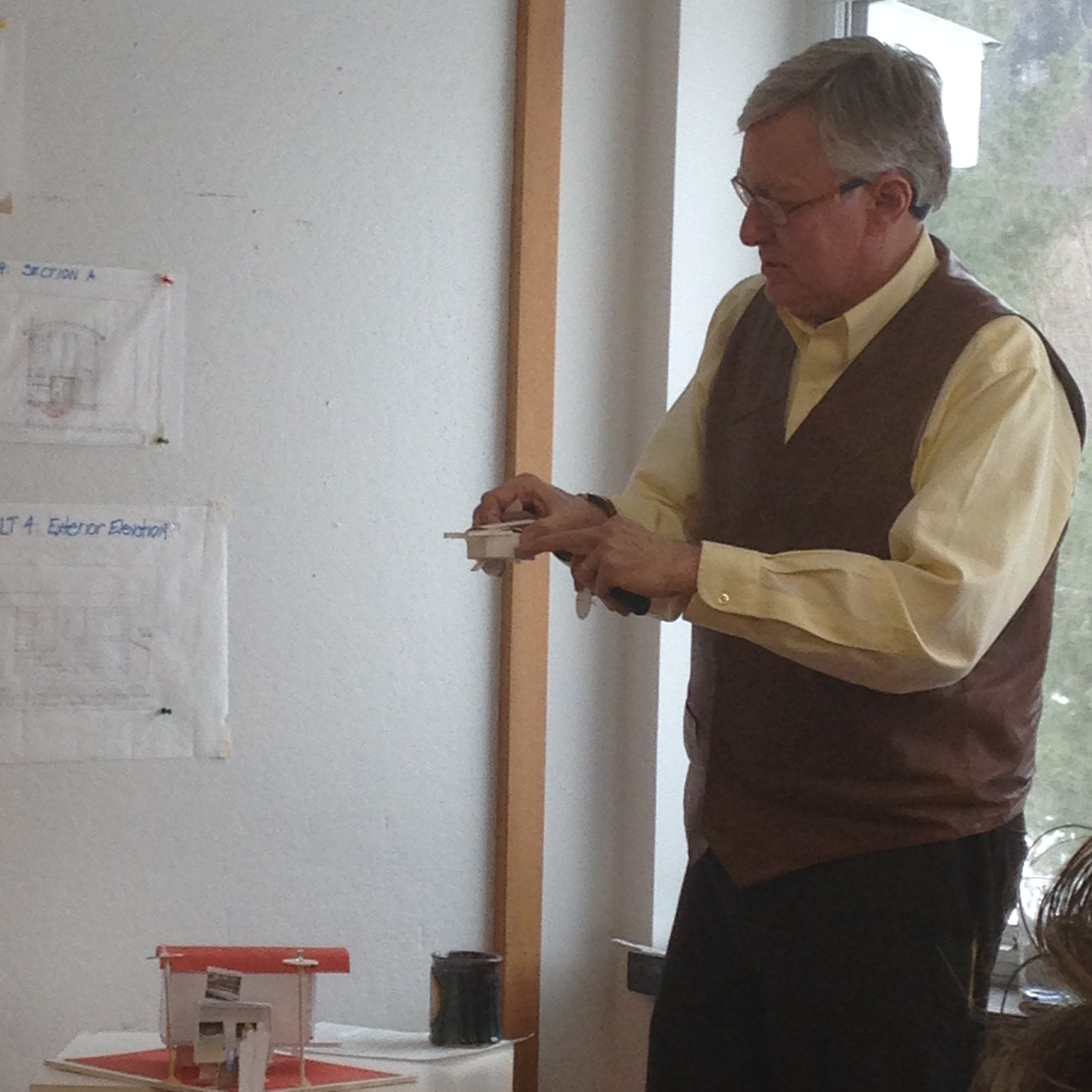
This morning our presentations began at nine and everyone presented his or her work and then receive feedback from their classmates and our reviewers. Paul Hanke and Kathy Meyer are both architects and seasoned Yestermorrow instructors, so they brought a fresh set of eyes and great insights.
It was a delight to see the designs our students developed over the course of the week, including:
- Bert’s mobile house and studio
- Carol’s historic barn to cottage conversion
- Dani’s southern farmstead with indoor-outdoor rooms
- Emily’s complex of yurt dwellings
- Eric’s tiny house on a trailer with a unique roofline
- Genevieve’s little house on the go
- Jason’s timber-framed cabin
- Luke & Katie’s renovation to create a cozy community
- Matt’s caboose-inspired home, art studio, and apothecary
- Max’s sailboat-inspired off-grid tiny home
- Rick’s vardo as showman’s wagon
What an honor it is to teach at Yestermorrow and enjoy the company and creativity of such inspiring students!
I’m looking forward to my next week-long small home design course, which I’ll be co-teaching with John Labovitz in Portland, OR in November. Contact me if you’d like to be added to the notification list for more information!
Less Is More Tours & Programming
 We're about to begin our third day of Yestermorrow's Less is More class, which is focused on small home design. The first two days had a similar itinerary: small home tours in the morning, afternoon design lessons, and evening presentation and studio time. (Today the high is supposed to be 17 degrees, so it's probably just as well our tours have wrapped up!)
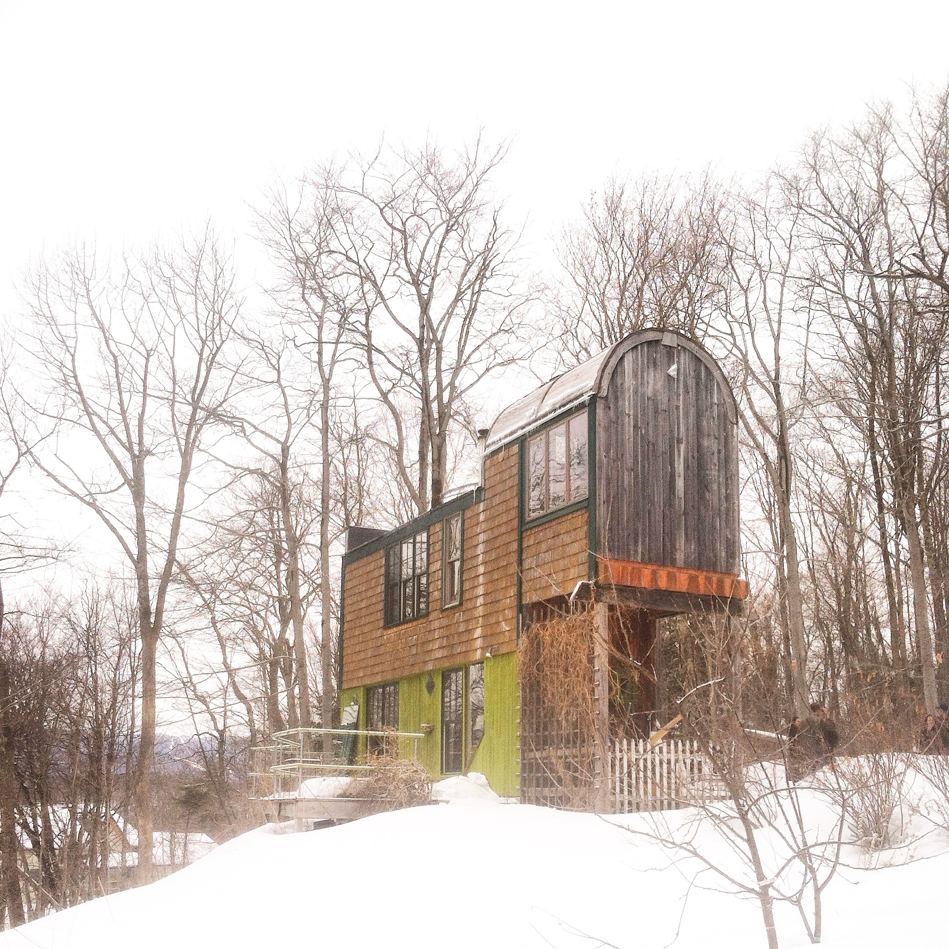
In just two days we've had the chance to explore seven homes, ranging from 200 to 2000 square feet. And while the larger homes are certainly not tiny (and I wouldn't consider them small either), they did offer good ideas for clever storage, creative work-arounds, and matching layout to program. They also provided good fodder for last night's discussion about design concepts that make small spaces seem larger. We now have good examples to point to as we discuss the strategies we're using in our own small home designs. This group of students has been asking great questions and they do a wonderful job working together to understand the various considerations and trade-offs when designing a small space. I'm looking forward to seeing their designs evolve!
They've already begun exploring layouts both in our life-size mock up and on trace paper. Today we'll continue the process with elevations and sections.
